
Olympikus: Brand Identity



Aug 2022
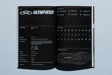
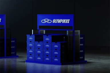
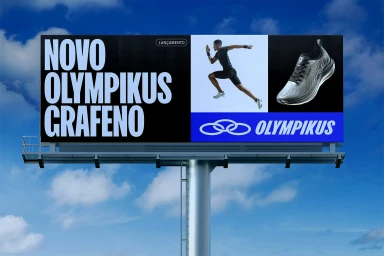
Olympikus's brand identity overhaul establishes a cohesive visual system across print, retail, and outdoor media. The project centers on a disciplined application of minimalist typography and stark graphic design, as seen in the technical specification manuals that dictate logo usage and product standards. The identity extends into retail environments through custom, monochromatic display units that emphasize material precision. Outside of the footwear brand's core scope, the work incorporates diverse graphic and editorial elements, including architectural brochures and promotional signage. Projects by Porto Rocha, DutchScot, Kira Koroknai, Studio Brutus, Susanna Foppoli, and Carolina Magro contributed to the development of this expansive corporate system, utilizing a clean, commercial aesthetic that balances bold geometric forms with structured layout principles.
Horizontal, Commercial, Clean


