
Northzone: Brand Identity
Jun 2020
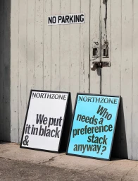
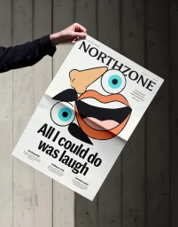
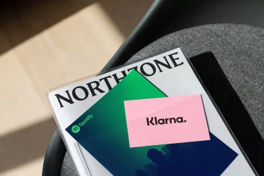
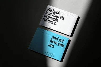
In the often-homogenous landscape of enterprise technology, the latest brand identity for venture capital firm Northzone by the team at Ragged Edge arrives as a masterclass in editorial minimalism. Moving away from the sterile, predictable tropes typical of the B2B software sector, the project leans into a raw, tactile aesthetic that prioritizes provocative messaging over corporate jargon. By utilizing a deliberate combination of hard light photography and heavy-weight typography, the identity forces a confrontation between the brand's bold, direct voice and the physical medium it occupies. Whether displayed as large-scale signage against weathered, urban textures or captured in a series of close-up, high-contrast compositions, the work feels refreshingly human. The use of vibrant accent colors—deep orange, electric blue, and punchy green—serves to anchor the identity, grounding high-concept corporate positioning in tangible, approachable visuals. Incorporating techniques like delicate emboss and deboss detailing, the collateral feels less like marketing material and more like an artifacts collection, suggesting that the firm values substance over mere presence. This brand identity succeeds by treating business communication with the same creative rigor found in high-end editorial design, resulting in a cohesive visual language that feels both authoritative and startlingly honest. It is a striking departure from convention that effectively reframes the brand as a modern, human-centric partner in the global technology ecosystem.
Clean, Horizontal, Commercial
Typography
Brand Film / Corporate Video
