
Brand
ProjectBrand Identity
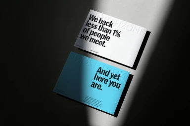
Northzone Brand Identity 2020
Associated creatives

Tags
Description
Two rectangular cards showcasing the Northzone brand identity rest on a textured grey surface. The top card is white with prominent debossed branding and bold black typography reading We back less than 1% of people we meet. The lower card is blue, featuring bold black typography stating And yet here you are with smaller supporting text below. Hard directional light casts a strong diagonal shadow across both cards, creating high-contrast depth.