
Brand
ProjectBrand Identity
Northzone Brand Identity 2020
Associated creatives

Tags
Description
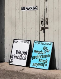
This graphic design project for Northzone showcases two framed posters leaning against a weathered, pale wooden double door outdoors. The poster on the left features a white background with bold black typography reading "We put it in black &". The poster on the right features a bright blue background with prominent black text reading "Who needs a preference stack anyway?". A rectangular "NO PARKING" sign is mounted on the wooden door directly above the posters, and a padlock secures the closed doors. Natural sunlight casts soft shadows on the concrete ground below.