
New Name: Brand Identity

Brand
Date
Apr 2021
Description
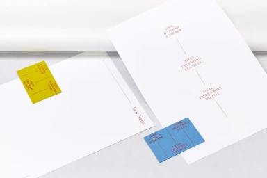
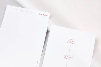
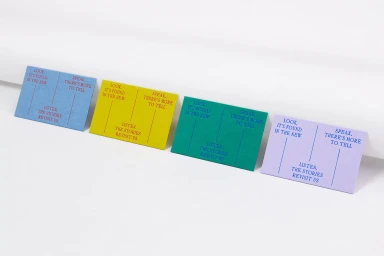
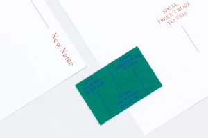
This brand identity project for New Name centers on a cohesive suite of print collateral, utilizing a refined visual language across stationery and cards. The work, executed by A Practice for Everyday Life, emphasizes a minimalist aesthetic defined by sharp typographic hierarchies and structured layouts. The execution relies on a curated palette of white, red, yellow, and blue, contrasted against dark green and olive-gold backdrops. Incorporating clean typography and precise emboss & deboss techniques, the project focuses on material tactility and formal arrangement under bright, natural light.
Style
Horizontal, Commercial, Clean, Minimalist
Techniques
Typography
Background
White Seamless
Context
Website / Web
Associated creatives

5000+ creatives to discover
Sign up to gain access to the entire directory. It’s free.
Visie is a curated library of creative professionals.