
Feilden Fowles: Brand Identity



Brand
Date
Apr 2021
Description
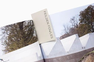
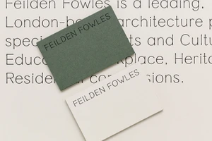
Feilden Fowles’ brand identity, executed by A Practice for Everyday Life, centres on a refined modernist aesthetic. The visual system prioritises clarity and balanced spacing, utilising clean sans-serif typography paired with a subtle monogram logo across a range of stationery assets. The project incorporates tactile paper textures, layering muted green tones against off-white surfaces. Through a mix of commercial flat-lays and editorial spreads, the identity features elements of screen print/silkscreen techniques to emphasise a minimalist approach to graphic design and brand hierarchy.
Style
Horizontal, Commercial, Clean, Minimalist
Techniques
Typography
Color
Cream
Associated creatives

5000+ creatives to discover
Sign up to gain access to the entire directory. It’s free.
Visie is a curated library of creative professionals.