
MUTHA: Brand Identity

Jan 2020
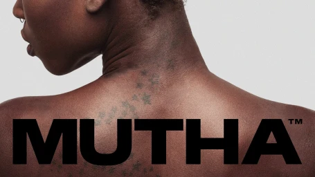
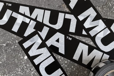
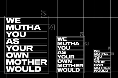
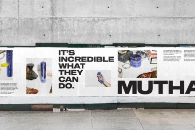
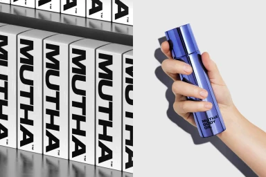
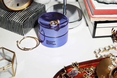
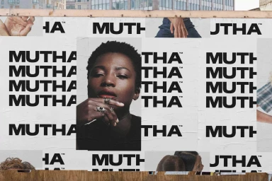
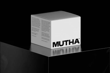
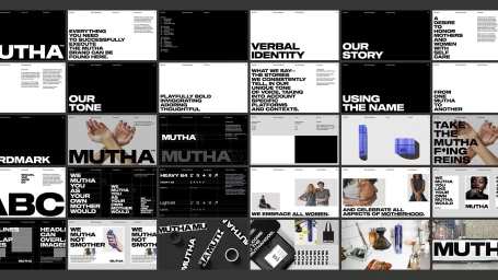
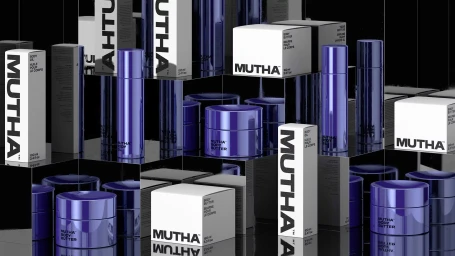
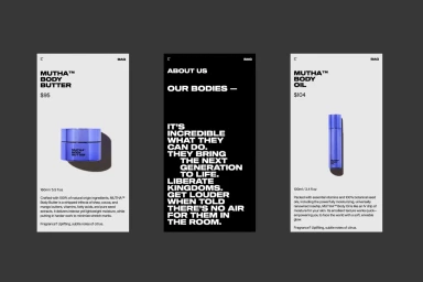
The brand identity for skincare label MUTHA emerges as a masterclass in modern, minimalist communication, leveraging a stark monochromatic palette to cultivate an air of high-end authority. By leaning into bold, sans-serif typography as the primary visual anchor, the project establishes a commanding typographic hierarchy that feels both industrial and deeply personal. The design strategy creates a deliberate interplay between raw, street-level grit and polished, editorial minimalism, effectively bridging the gap between luxury skincare and authentic human connection. Through the strategic use of high-contrast layouts and negative space, the identity feels structured yet expressive, utilizing motifs like overlapping collage elements and grid-based compositions to build a cohesive narrative. From the tactile application of branded adhesive tape on weathered concrete to the precise, reflective product staging, the execution reinforces a philosophy of directness, where the power of the word is equal to the sophistication of the packaging. With creative direction from Character, the project successfully synthesizes various aesthetic cues—ranging from soft light portraits to rigid corporate guidelines—into a unified brand language. Ultimately, the work reads as an exercise in confident restraint, where the consistent application of a sharp black-and-white visual system elevates the skincare products, positioning MUTHA not just as a consumer good, but as a lifestyle marque grounded in modern, structured design principles that resonate across diverse commercial and editorial channels.
Horizontal, Commercial, Clean, Minimalist
Typography
