
Mooradian Studio: Brand Identity
Feb 2023
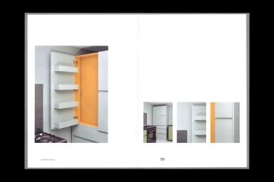
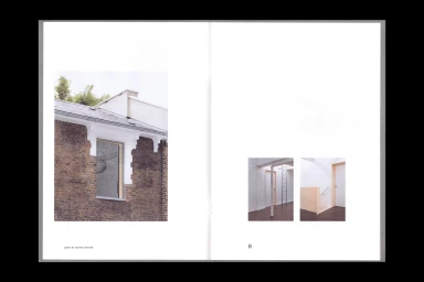
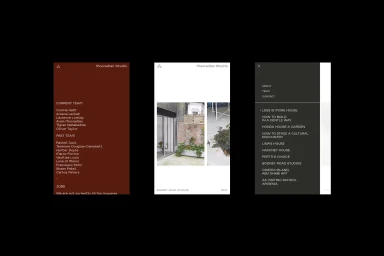
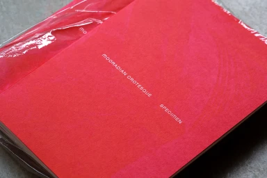
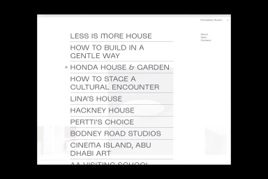
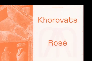
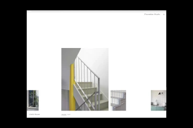
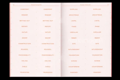
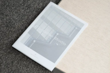
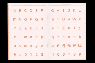
The brand identity for Mooradian Studio, executed by Polytechnic, functions as an architectural and design-focused system defined by a clean, minimalist aesthetic. The project spans print collateral, editorial spreads, and digital interfaces, all linked by a restrained typographic approach that prioritizes negative space and structured grid layouts. The system features the custom typeface 'Mooradian Grotesque,' showcased through detailed type specimen books and modular web layouts. Photography by Thomas Adank provides a textural anchor for the visual identity, focusing on architectural details, interior spatial planning, and tactile material studies. The design language employs a consistent hierarchy, using bold orange and red accents against neutral, off-white backgrounds to frame structural photography and project directories.
Horizontal, Clean, Minimalist, Commercial
Typography
Editorial

