
Misshumasshu: Brand Identity






Jun 2019
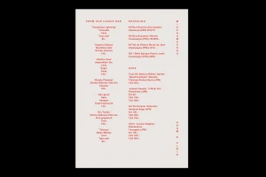
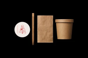
The brand identity for Misshumasshu, developed under the precise graphic design direction of Daniel Carlsten, masterfully balances utilitarian functionality with a striking, contemporary aesthetic. This project transcends traditional food-service branding by leaning into a rigorous, minimalist framework that prioritizes bold typography and a controlled, high-contrast color palette. Through the strategic use of vector graphics and deliberate negative space, the visual system communicates a sophisticated, modern narrative suitable for a high-end culinary experience. The execution demonstrates a deep commitment to cohesive identity design, evidenced by the seamless application of sans-serif red lettering across diverse touchpoints, including sustainable kraft packaging, menu layouts, and abstract line art illustrations. By employing clean, geometric shapes and rhythmic, wavy patterns, the identity channels an artistic sensibility while maintaining the necessary clarity for commercial utility. The result is a tactile, well-considered suite that manages to feel both organic and structural. Whether through the stark, black-background compositions or the vibrant, gradient-focused vector illustrations, the work remains anchored by its typographic consistency. This approach ensures that every element, from the menu structure to the collateral, reinforces a unified brand voice that is as visually engaging as it is professional, successfully setting a new benchmark for minimalist, identity-driven design in the food and beverage industry.
Artistic, Minimalist
Vector
Advertising Campaign
