
Sabelli-Frisch: Brand Identity


Jun 2020
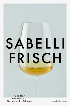
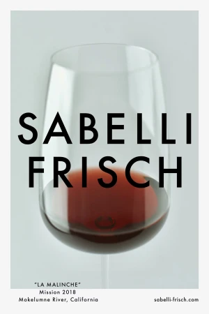
The brand identity for Sabelli-Frisch captures the essence of viticultural craftsmanship through a visual language defined by editorial minimalism and high-end commercial precision. By centering the aesthetic on a stark, modern palette, the project elevates the humble wine label into an exercise in understated luxury. The execution relies heavily on the clean application of bold, sans-serif typography, which floats elegantly across both product photography and glass-side overlays. Daniel Carlsten’s graphic design work serves as the backbone of this identity, utilizing sophisticated techniques like emboss and deboss detailing on the label stock to introduce a tactile, high-quality dimension that invites close inspection. These macro perspectives reveal the subtle interplay of textures, from the weight of the dark glass bottles to the artisanal charm of the signature blue wax seals. Every composition, whether utilizing soft light to emphasize the clarity of the wine or cinematic framing to heighten the drama of the bottle’s silhouette, reinforces a narrative of premium quality rooted in California origins. By embracing a symmetrical, uncluttered layout and leveraging negative space, the branding avoids industry clichés, opting instead for a quiet confidence that mirrors the complexity of the vintages themselves. The result is a cohesive brand system that successfully bridges the gap between traditional food and beverage heritage and contemporary, design-forward packaging sensibilities.
Vertical, Commercial, Clean, Minimalist
Advertising Campaign
