
Ya-sin Chahimi: Brand Identity

Dec 2018
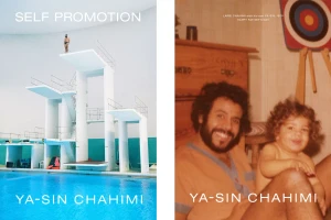
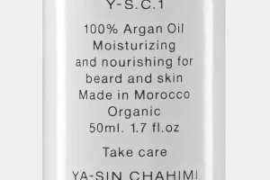
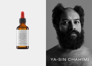
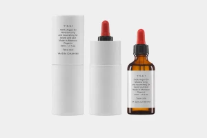
The brand identity for Ya-sin Chahimi masterfully bridges the gap between clinical skincare precision and deeply personal heritage, establishing a visual language that feels both established and intimate. Under the sharp creative direction of Daniel Carlsten, the project leans into a minimalist aesthetic that relies heavily on strict geometric layouts and high-contrast typography to communicate authority. This commercial beauty campaign is defined by its clever juxtaposition of styles, pairing the stark, clean lines of 3D render and CGI product shots with the warmth of analogue film. By contrasting the clinical, high-key studio photography of Moroccan argan oil packaging against grainy, nostalgic archival snapshots, the identity creates a narrative of authenticity. The graphic design remains restrained, utilizing a simple sans-serif typeface to ensure legibility remains the focal point across every application, from bottle labels to portraiture. This project operates as a masterclass in modern brand development, demonstrating how a singular, cohesive aesthetic can unite diverse visual techniques—ranging from live-action cinematic compositions to structured product photography. Every element, from the deliberate choice of amber glass bottles to the soft, natural light captured in the portraiture, reinforces a brand story rooted in organic quality and professional care, successfully positioning Ya-sin Chahimi as a refined player within the contemporary skincare market.
Horizontal, Clean, Minimalist, Commercial
