
Milu: Brand Identity
Nov 2020
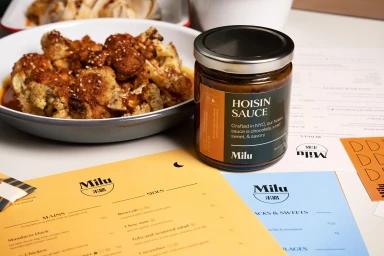
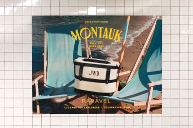
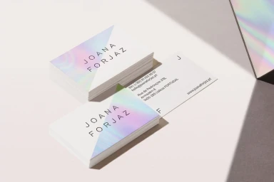
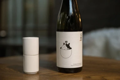
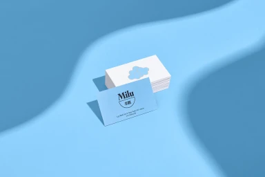
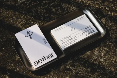
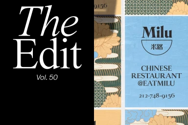
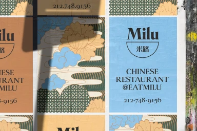
Milu’s brand identity project establishes a multifaceted visual language that spans from culinary product photography to urban print installations. The work features a clean, minimalist design approach characterized by a distinct celestial logo, crisp serif typography, and a balanced palette of terracotta, soft blues, and warm neutrals. Executed through a collaborative effort including Saint-Urbain, aether3, Lizzie Frost, Love St. Studio, and Decade, the project encompasses both corporate stationery and environmental graphics. The aesthetic leans into high-contrast textures, utilizing holographic foil treatments on business cards and wheat-pasted posters in city settings, all unified by a consistent graphic hierarchy and deliberate lighting.
Horizontal, Commercial, Clean


