
Merry Pops: Brand Identity
Brand
Date
May 2022
Description
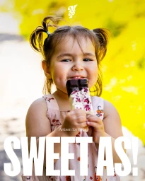
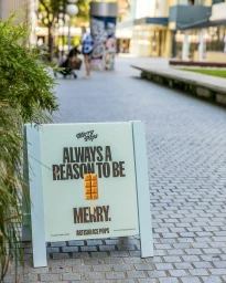
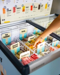
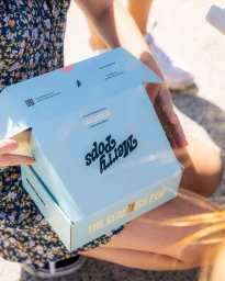
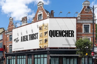
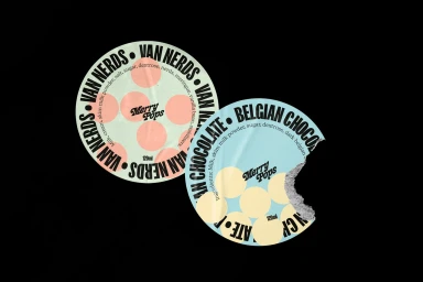
The brand identity for Merry Pops establishes a cohesive visual language for the artisan ice pop label across both digital and physical touchpoints. The project spans 3D product animation, custom packaging design, and a range of commercial advertising materials that lean into a clean, contemporary aesthetic. Sebastian Páez, Elle Haramis, and Nando collaborated on the project, utilizing 3D render / CGI techniques and natural light photography to ground the brand. The identity balances bold, playful typography with a minimalist approach to signage and retail display, seen in everything from the custom packaging boxes to the textured masonry storefront installations.
Style
Commercial, Clean
Industries
Color
Pure White
Context
Advertising Campaign
Associated creatives


5000+ creatives to discover
Sign up to gain access to the entire directory. It’s free.
Visie is a curated library of creative professionals.