
Brand
ProjectBrand Identity
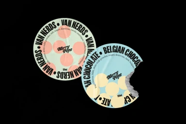
Merry Pops Brand Identity 2022
Associated creatives


Tags
Description
This project showcases the brand identity and packaging design for Merry Pops. The composition features two round ice cream container lids set against a solid black background. The left lid displays a mint green surface with pink polka dots and bold black circular typography reading Van Nerds. The right lid features a light blue surface with yellow polka dots, bold black typography reading Belgian Chocolate, and a distinct torn bite mark revealing textured paper underneath. The lighting is clean and even, accentuating the flat design and playful aesthetic.