
Merino: Brand Identity

May 2020
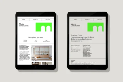
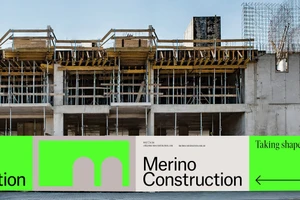
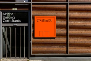
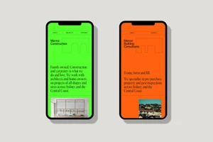
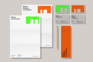
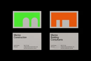
In the crowded landscape of real estate platforms, Merino distinguishes itself through a visual language that balances raw industrial utility with sophisticated design clarity. Executed by the creative team at Accompany, this comprehensive brand identity project creates a cohesive bridge between construction services and building consultancy. By leveraging a bold, high-contrast palette of vibrant lime green and energetic orange, the studio successfully anchors the brand within an urban context, as evidenced by their strategic use of live-action technique on construction site hoardings and signage. The identity system, which utilizes crisp serif typography alongside structured grid navigation for UI illustration, achieves an editorial minimalism that translates seamlessly across diverse touchpoints. Whether applied to high-impact outdoor advertising boards or the intimate scale of business cards and stationery, the design remains grounded in architectural concepts. The use of natural light in physical touchpoints reinforces a sense of authenticity, while the digital interfaces lean into geometric abstraction to simplify complex service offerings. By maintaining a clean, legible hierarchy, the design ensures that Merino communicates professionalism without sacrificing visual punch. The resulting brand presence is both assertive and approachable, transforming standard property services into a modern, recognizable lifestyle aesthetic that speaks directly to the needs of the contemporary market.
Horizontal, Commercial, Clean, Minimalist
