
Mate Libre: Brand Identity
Aug 2020
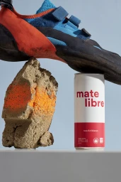
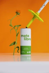
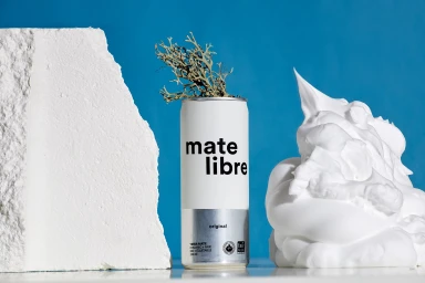
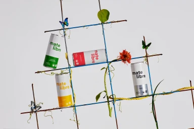
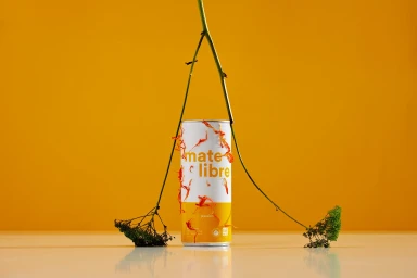
The latest brand identity campaign for Mate Libre masterfully reimagines the intersection of beverage marketing and conceptual still-life photography. By eschewing traditional lifestyle tropes in favor of an artistic, graphic-heavy approach, the project transforms the humble yerba mate can into the focal point of a series of meticulously staged compositions. Photographers Alex Blouin and Jodi Heartz capture the essence of the brand through a lens that emphasizes balance, texture, and high-key, soft light to elevate the product packaging. The creative direction, supported by the graphic design expertise of Wedge, leverages a bold, color-blocked aesthetic that channels a minimalist, contemporary vibe. Whether positioning a can alongside a climbing shoe and textured rock or weaving delicate green vines and butterfly figures into a structured wire garden grid, the imagery leans into a playful yet refined botanical-inspired aesthetic. These commercial photographs rely on sharp, clean sans-serif typography and high-contrast, saturated backgrounds to define the brand identity. By integrating organic elements like lichen, dried petals, and slender plant stalks against synthetic, man-made objects, the work creates a compelling tension that feels both cinematic and rooted in modern design principles. It is a thoughtful exploration of form and color that successfully positions Mate Libre as a refreshing, design-forward player within the competitive beverage industry, proving that product photography can be as much about abstract storytelling as it is about refreshing refreshment.
Vertical, Commercial, Clean, Minimalist
Natural light
Solid Colour
E-commerce / Product


