- Home
- ·Projects
- ·Luka Zeichmann
- ·2020
- ·Brand Identity


Luka Zeichmann Brand Identity 2020
About
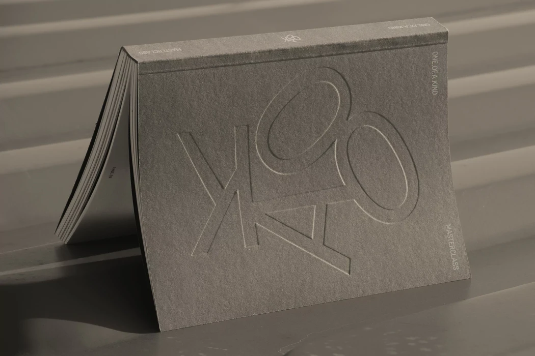
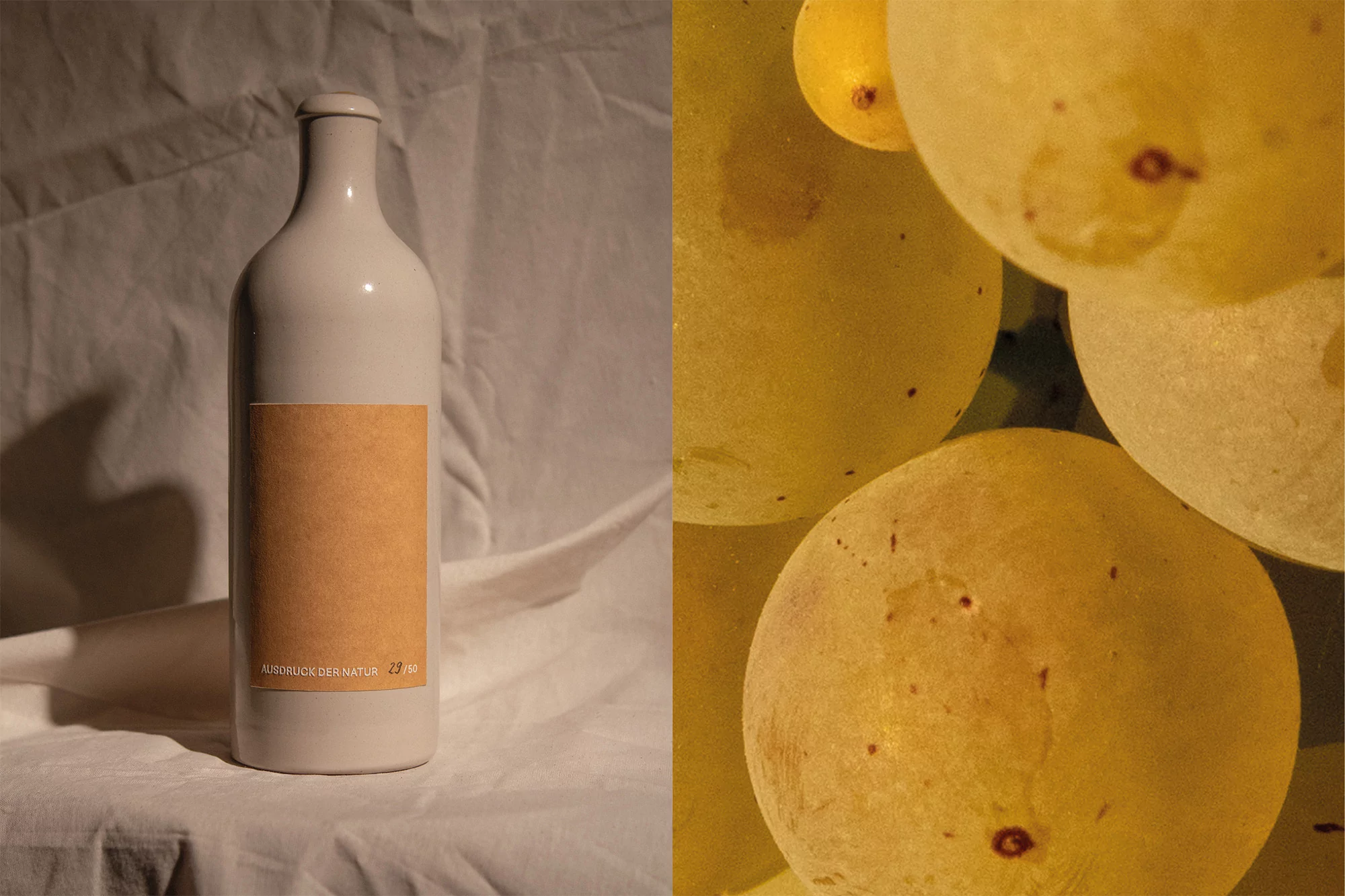
Luka Zeichmann’s latest brand identity project serves as a masterclass in minimalist design, bridging the gap between tactile, organic materiality and sleek digital precision. The creative team, featuring designers Kevin Nowak and Sebastian Hofer, meticulously crafts a visual narrative that leans into the raw beauty of natural textures. Through a series of carefully curated compositions, the work explores themes of winemaking tradition and modern aesthetics. High-end photography from Julian Poropatich, Mateusz Najder, and Roland Schafek captures these still life arrangements with cinematic flair, utilizing soft light and chiaroscuro techniques to heighten the interplay between the crisp geometry of print collateral and the fluid, earthen tones of the desert and soil. Web development by Thomas Strobl grounds these artistic explorations in a functional UI illustration, successfully marrying the messiness of fresh produce—like grapes captured in extreme macro—with the structured, sans-serif sophistication of the brand’s digital presence. The project effectively utilizes a low-key aesthetic and natural light to convey a sense of artisanal integrity, with elements like hand-numbered edition cards and textured paper stocks reinforcing a sense of exclusivity. This cohesive identity project does not merely present a product; it invites the audience into a tactile, sophisticated world where the organic and the manufactured coexist in perfect, balanced harmony.