
Kunsthal Extra City: Brand Identity



Aug 2021
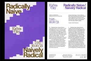
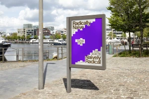
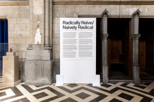
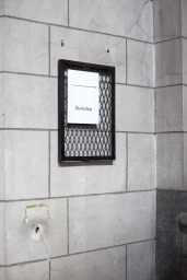
Kunsthal Extra City engages a rigorous visual language in this comprehensive brand identity project, developed by Ward Heirwegh. The work establishes a clear institutional aesthetic through bold typography and a precise monochrome purple and white palette, applied across a wide range of touchpoints from exhibition posters and editorial publications to site-specific environmental signage. Utilizing clean graphic design and vector-based compositions, the system balances contemporary geometric forms against the historic architecture of the cultural space. The application extends to functional promotional materials, including custom-printed textiles, further integrating the brand into the physical environment of the art center.
Horizontal, Clean
Typography
