
Kortrijk: Brand Identity
Jun 2020
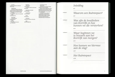
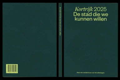
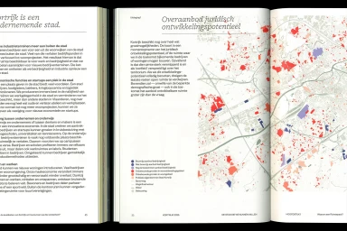
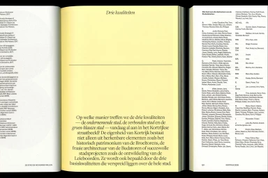
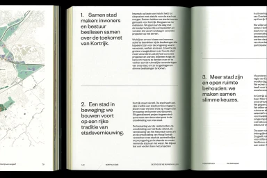
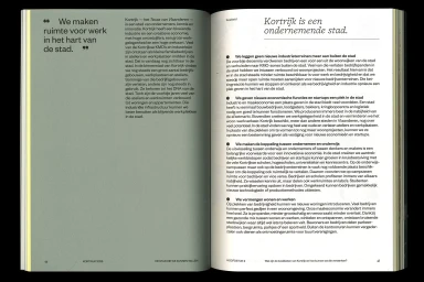
The brand identity for Kortrijk effectively translates complex urban development goals into a sophisticated, cohesive visual language. Designed by Ward Heirwegh, the project functions as a masterclass in corporate editorial design, balancing the rigors of civic documentation with a refined, modernist aesthetic. The identity system utilizes a restrained color palette of deep forest green, soft lime, and matte pastels to establish a professional yet accessible tone. Through the strategic use of minimalist typography, the work achieves a remarkable level of organizational clarity, turning dense policy information into an engaging, readable experience. The integration of data visualisation is particularly adept, as seen in the meticulously rendered cartographic spreads that decode urban zoning and land usage with geometric precision. By prioritizing negative space and clear typographic hierarchies, the design elevates standard municipal literature into a premium publication that mirrors the ambition of the city itself. This brand identity project does more than just organize data; it cultivates an inviting atmosphere for stakeholders, leveraging clean layouts and high-contrast visuals to communicate the strategic vision of Kortrijk. The result is a robust, functional, and highly polished corporate framework that honors the complexity of city planning while maintaining an unwavering focus on accessibility and modern graphic design principles.
Editorial, Horizontal, Clean, Minimalist
Typography
Editorial
