
Kobase: Brand Identity


Apr 2025
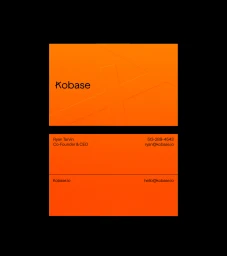
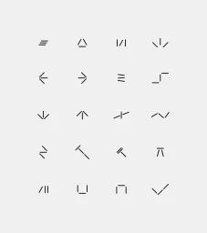
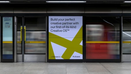
The brand identity for Kobase, a creative operating system, focuses on a modular visual language that balances technical precision with organic textures. The system employs a clean, minimalist aesthetic, using vibrant color blocking and dynamic typographic animations to represent the brand's multifaceted digital tools. Graphic design for the project was led by Twice Shy, with motion design by Marc Ferrer Vives and Jay Culley. The visual system integrates 3D elements developed by Eaton Crous, featuring everything from abstract wireframe grids to tactile CGI renders. Supporting web copy was provided by Louise Baker, rounding out an identity that spans digital platform interfaces and environmental architectural installations.
Commercial, Clean, Minimalist
Motion Graphics
Brand Film / Corporate Video


