

Unbox Brand Identity 2026
About
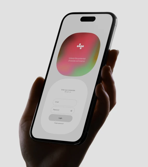
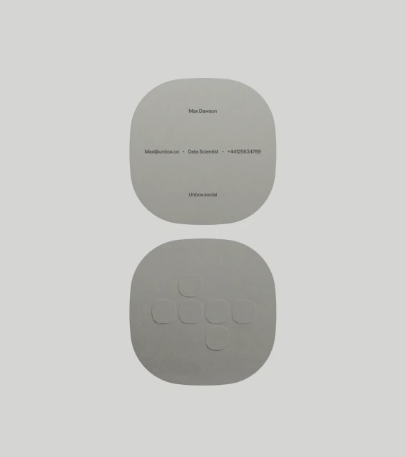
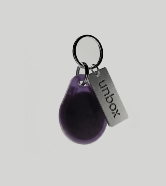
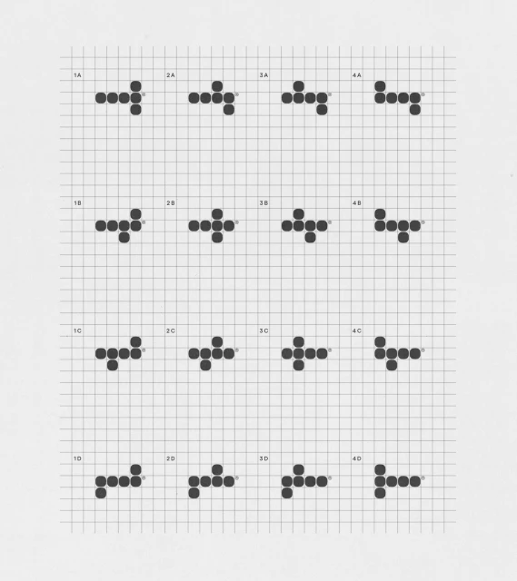
For the Unbox brand identity, design studio Twice Shy has crafted a comprehensive visual language that bridges the gap between functional technology and approachable digital interfaces. The project, which spans across Apps and Digital Platforms, centers on a modular, geometric system that balances technical rigor with soft, human-centric design. By utilizing a clean, minimalist aesthetic, the identity effectively leverages commercial and vector-based assets to ensure brand consistency across various touchpoints. The digital experience, brought to life through elegant UI illustration, features soft-edged gradients that offer a tactile, organic contrast to the structured grid layouts seen throughout the brand collateral. Motion designer Jay Culley integrates this aesthetic into broader corporate environments, most notably within a contemporary auditorium setting where vibrant, fluid visuals communicate the brand's position in social commerce. Whether manifesting as embossed stationery, precision-engineered key fobs captured under studio strobe lighting, or a high-fidelity mobile login screen, the design remains cohesive and grounded. This project is a masterclass in modern branding, employing live-action technique and precise typography to transform abstract digital concepts into a tangible, professional ecosystem. By prioritizing clarity and a refined monochromatic color scheme, Twice Shy successfully creates a versatile identity that feels as intuitive as the technology it represents, ensuring that every interaction—from the screen to the physical product—remains deeply intentional and cohesive.
