
Kate Jackling: Brand Identity



Jan 2020
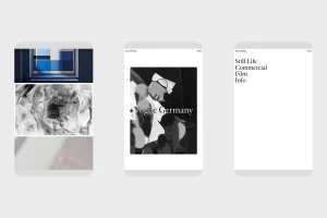
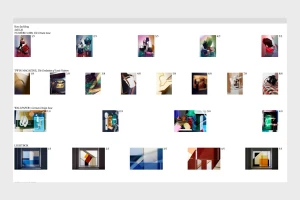
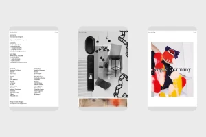
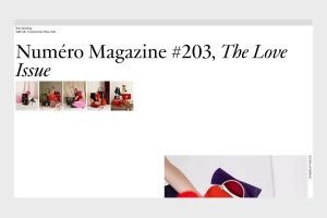
The brand identity for Kate Jackling establishes a sophisticated digital presence that mirrors the photographer’s elevated aesthetic through a marriage of minimalist UI illustration and structured editorial layout. By prioritizing expansive white space and elegant typography, the platform serves as a curated retrospective of Jackling’s expansive portfolio, which spans high-end luxury fashion, architectural color studies, and abstract still life photography. The brand identity leans into a clean, professional sensibility that allows the diverse range of works—from commercial film projects for prestige clients to experimental, artistic graphic arrangements—to remain the focal point of the viewer's experience. Executed in collaboration with Daily Dialogue, the design system utilizes a high-contrast palette and disciplined grid structures to organize a complex body of work, effectively bridging the gap between corporate commercial photography and avant-garde creative expression. Every element, from the navigation menus to the project thumbnails, channels a refined editorial minimalism that reinforces the brand's position at the intersection of commerce and art. This project succeeds not merely as a portfolio, but as a deliberate extension of the creator's visual language, successfully balancing rigid professional infographics with the fluidity of macro, soft light photography to maintain a cohesive, high-fashion aesthetic across both digital and static mediums.
Clean
White Seamless
Website / Web
