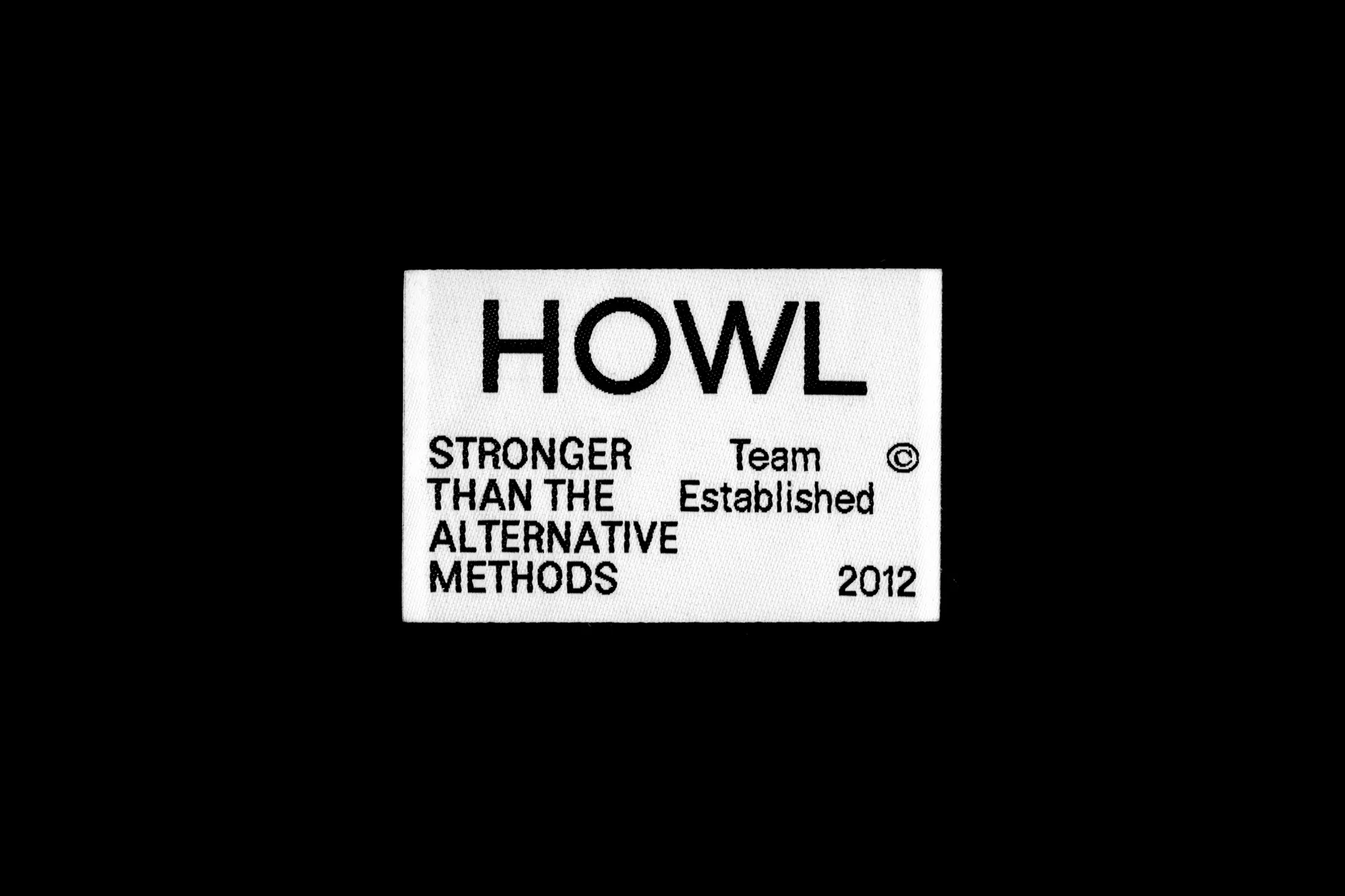
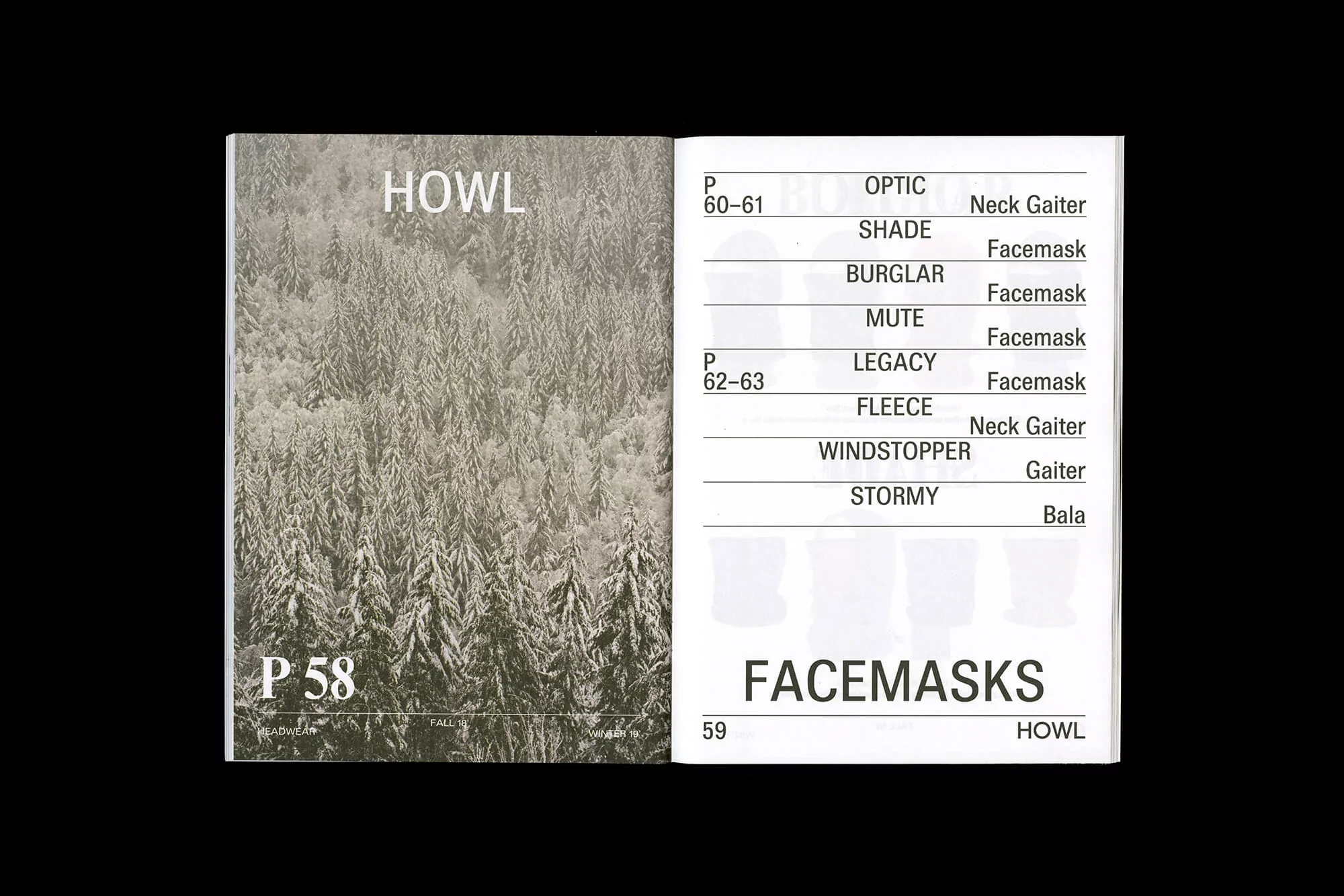
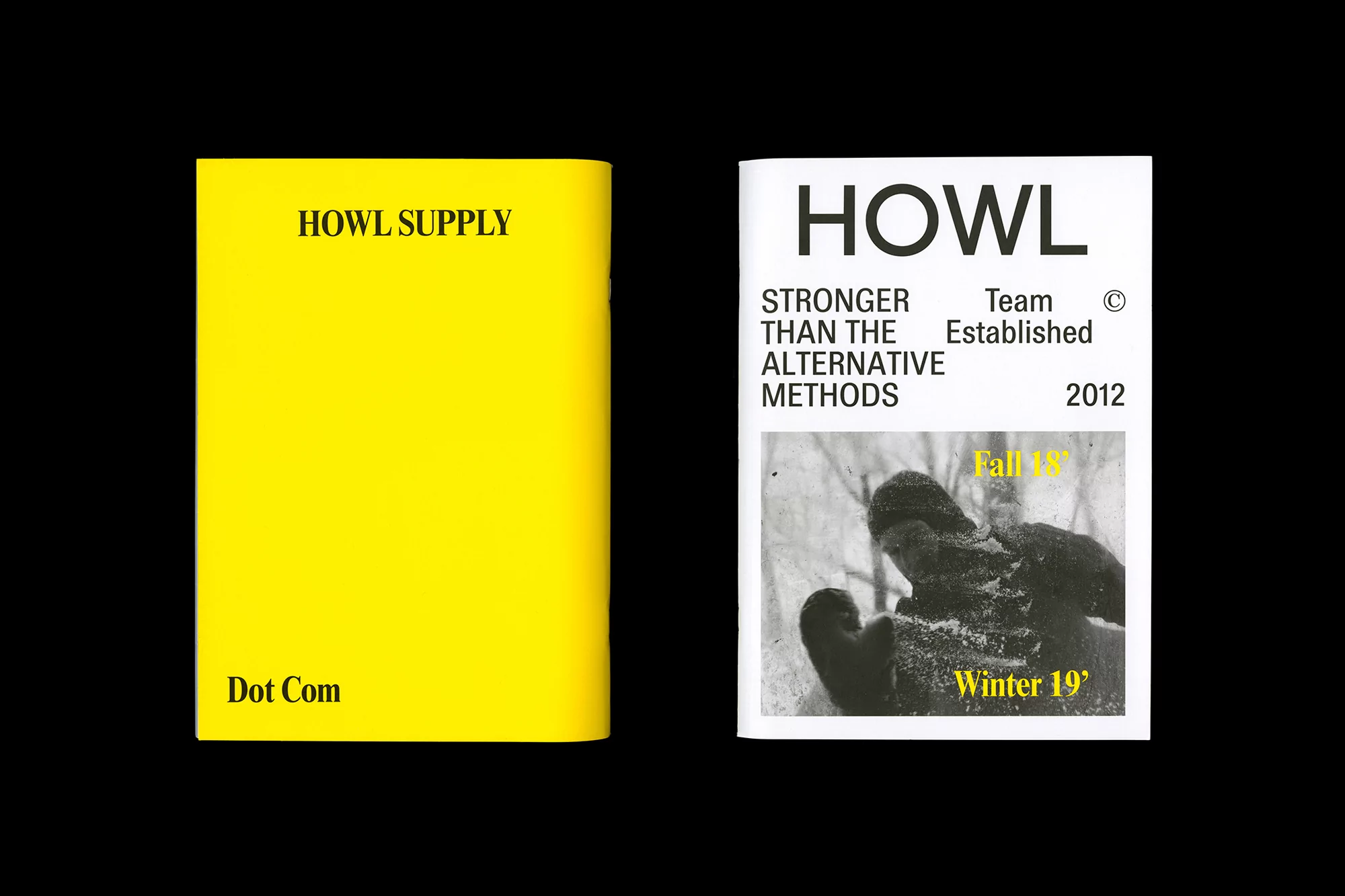
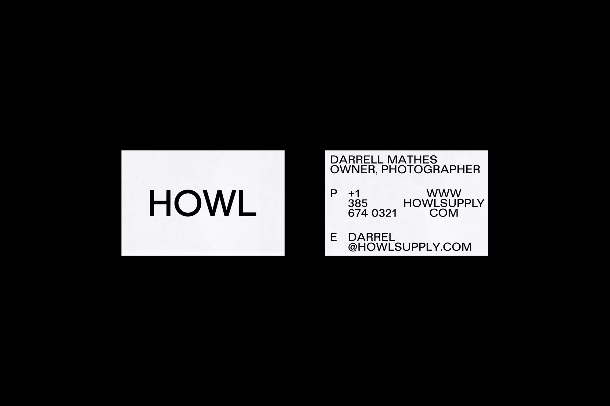
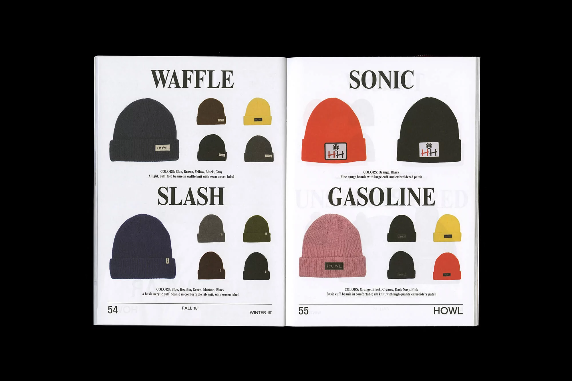
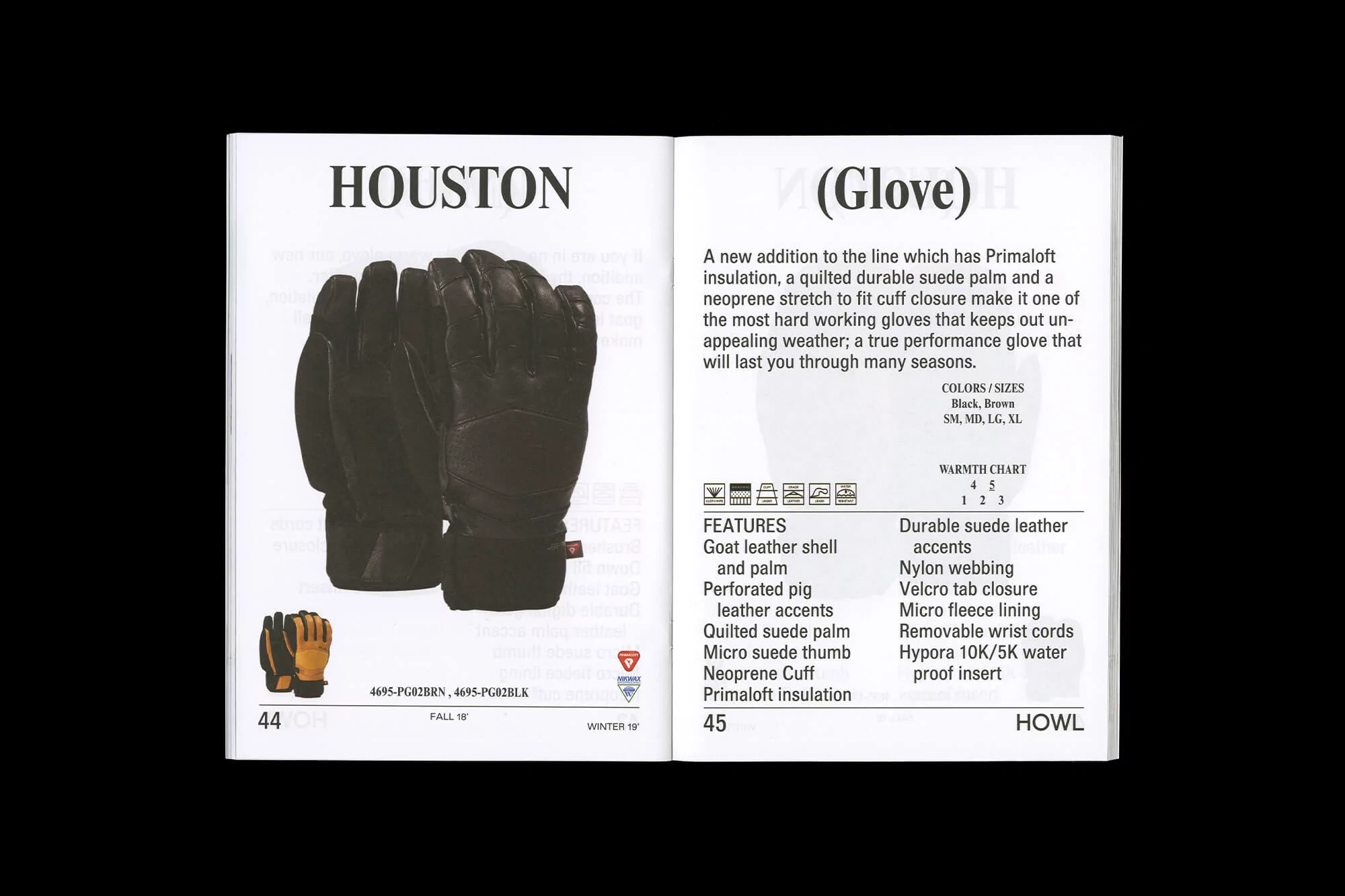
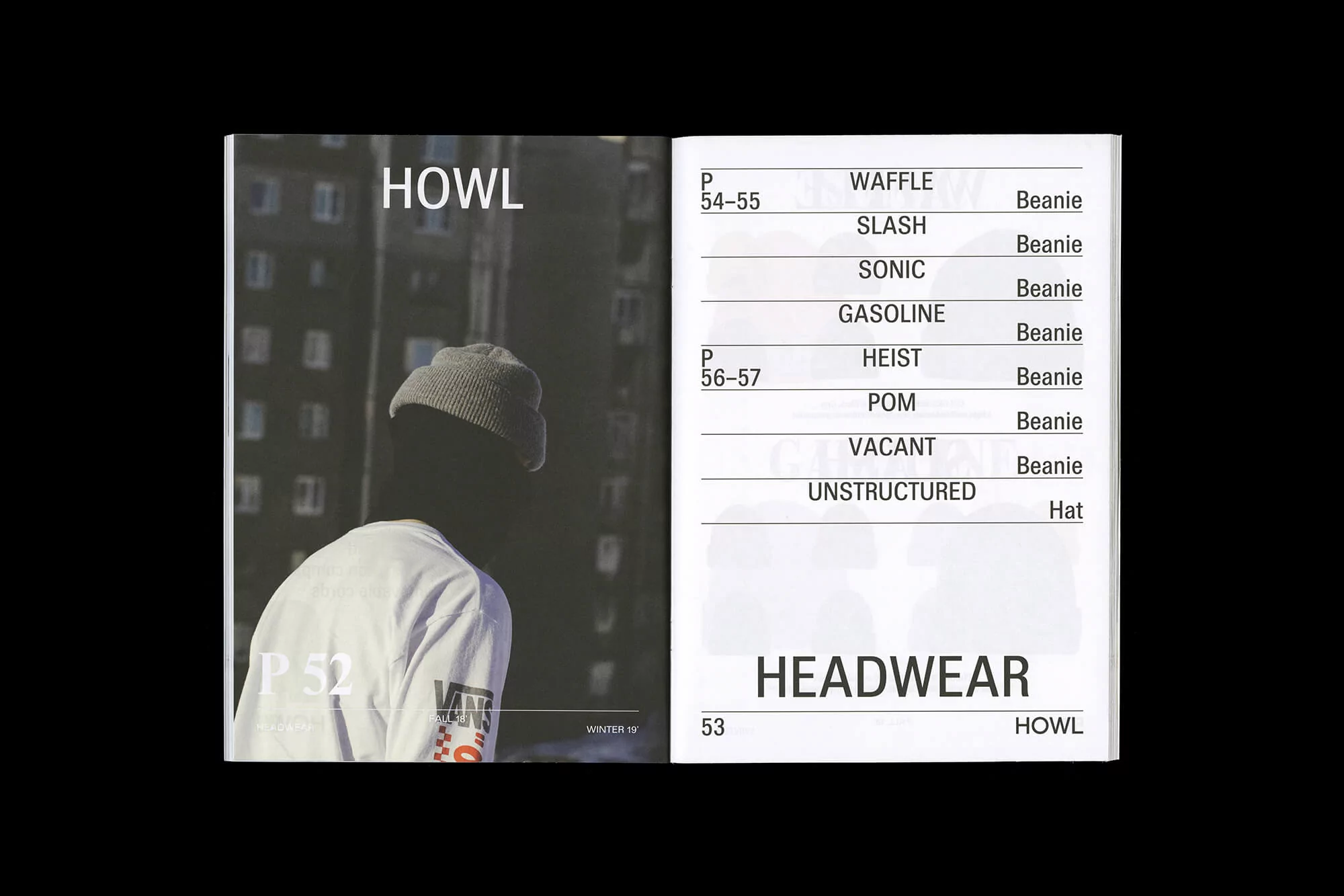
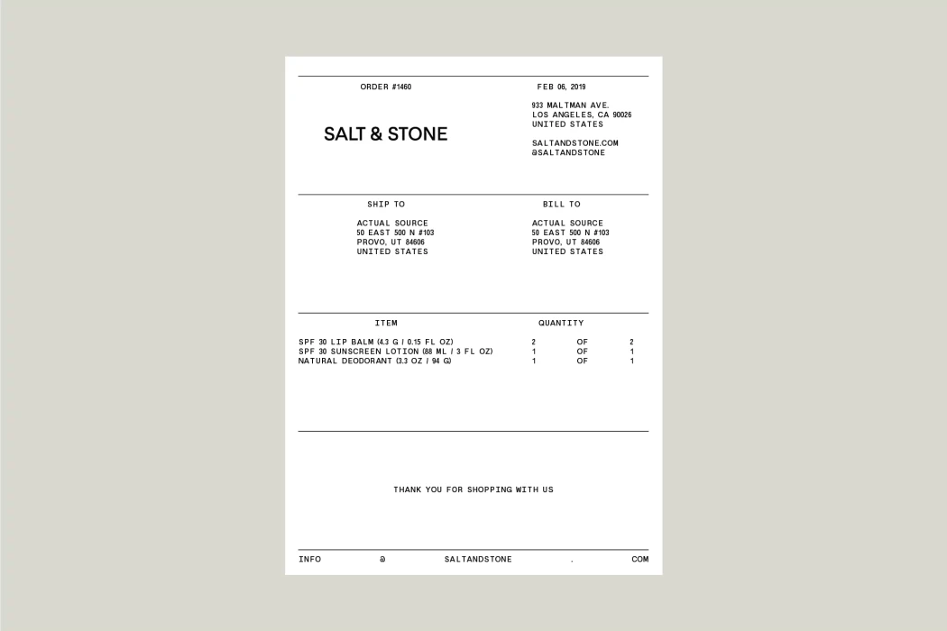
The brand identity for HOWL is a masterclass in functional minimalism, channeling a stark, monochromatic aesthetic that reinforces the brand's rugged, outdoor-oriented positioning. Executed with precise graphic design by Actual Source, the project centers on a clean, sans-serif typographic language that bridges the gap between high-fashion editorial and technical performance gear. By stripping away extraneous noise, the design leans into a high-contrast visual hierarchy that prioritizes information clarity, whether it is displayed on a woven garment label, a professional business card, or a detailed product catalog spread. The work employs a disciplined use of negative space, effectively utilizing vibrant yellow accents against deep black and white backdrops to create a recognizable, modern signature. Through the thoughtful integration of macro photography and structured grid-based layouts, the identity system translates complex product details—such as technical glove specifications and diverse beanie collections—into a coherent, professional narrative. This commercial identity project avoids unnecessary artifice, instead favoring a straightforward, robust design philosophy that mirrors the grit of the brand's 2012 roots. The result is a highly readable, versatile suite of materials that feels both deeply rooted in heritage and entirely contemporary, ensuring that every touchpoint serves as a functional tool for the end consumer while maintaining a bold, cohesive brand voice across every platform.