
Fialure: Brand Identity
May 2019
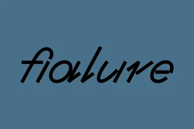
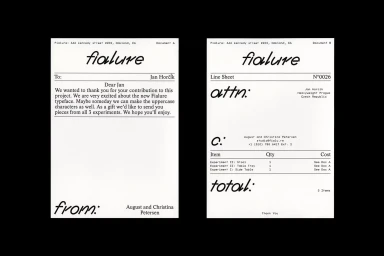
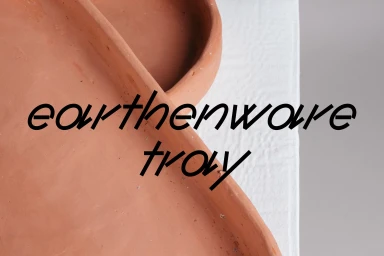
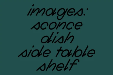
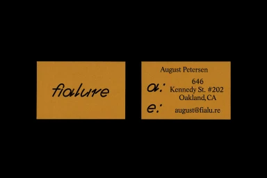
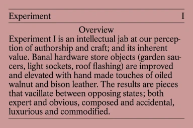
The new brand identity for Fialure represents a masterful exercise in restraint and conceptual precision, bridging the gap between industrial utility and refined craft. Spearheaded by Actual Source, the project establishes a cohesive visual language that finds beauty in minimalism. The identity centers on a dual typographic approach, balancing a custom, aggressive black sans-serif logotype against elegant, cursive display fonts that soften the brand’s otherwise rigorous, structured aesthetic. Across a range of assets—from corporate stationery to experimental product documentation—the design employs a sophisticated, muted palette of slate blue, deep teal, and mustard yellow to ground the brand. The work excels in its information architecture, utilizing clean layouts and bold contrast to present complex concepts, such as the blending of hardware store basics with luxury materials like bison leather and oiled walnut, in a highly accessible format. By marrying artisanal product macro photography with sharp, vector-based graphic design, the identity feels both professional and distinctively contemporary. The result is a brand that feels intellectually curated, emphasizing clarity and tactile quality through every touchpoint. This project serves as a compelling case study in modern typography, demonstrating how deliberate composition and consistent art direction can elevate even the most functional corporate materials into an artistic, cohesive brand system that commands attention without unnecessary embellishment.
Horizontal, Commercial, Minimalist, Clean
Typography
