
Salt & Stone: Brand Identity

Jun 2019
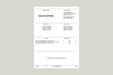
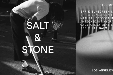
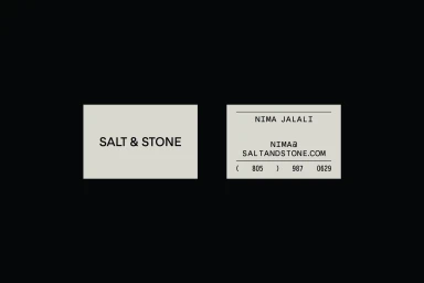
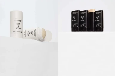
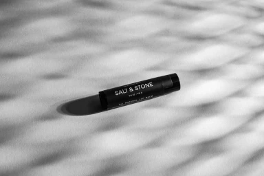
Salt & Stone redefines the intersection of utility and elegance with a brand identity that leans into a distinctly modern, clinical aesthetic. Developed in collaboration with the design studio Actual Source, the project meticulously distills the essence of a high-performance skincare and beauty label through a lens of editorial minimalism. The visual strategy effectively bridges the gap between the brand's active, outdoor-oriented ethos and its refined product range, utilizing a high-contrast monochrome palette that feels both grounded and aspirational. Throughout the campaign, the imagery captures a sophisticated tension between the technical nature of corporate assets—like structured invoices and business cards—and the tactile, lifestyle-driven product photography. By employing clean, bold sans-serif typography as a primary design element, the branding maintains a rigorous sense of symmetry and order. The execution shifts seamlessly from the stark, studio-lit geometric compositions of sun care tubes to the atmospheric use of dappled natural light, illustrating a versatile brand identity. Whether presented via a split-screen cinematic composition or through minimalist product shots, the project establishes a cohesive narrative that speaks to the clarity and purity of the Salt & Stone ethos. This corporate-meets-commercial visual language ensures the brand stands out in a crowded beauty market, proving that even the most functional design details, when executed with precision, can communicate a powerful, premium lifestyle promise.
Clean, Minimalist, Horizontal, Commercial
