
Hanover: Brand Identity

Apr 2025
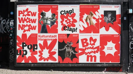
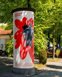
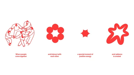
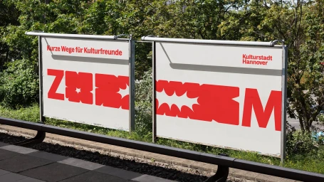
Graphic design studio EIGA developed a comprehensive brand identity for Hanover, centered on a high-contrast visual system of bold red typography and organic starburst graphics. The project utilizes clean, vector-based design to establish a flexible visual language that scales from digital social media interfaces to large-format outdoor advertising and public transit displays. The system integrates expressive motion graphics and fluid animation sequences, often featuring photographic vignettes that highlight cultural programming and public engagement. By combining sharp, minimal layouts with playful, human-centric imagery, the identity maintains a cohesive look across both print and screen applications.
Commercial, Clean, Horizontal
White Seamless
