
Katholino: Brand Identity

Sep 2025
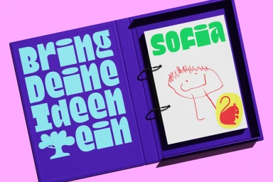
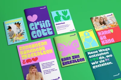
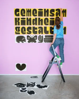
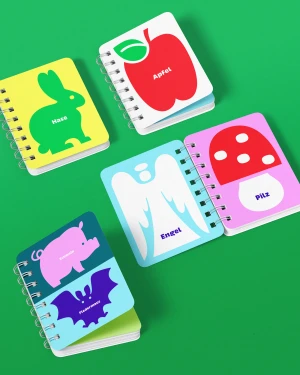
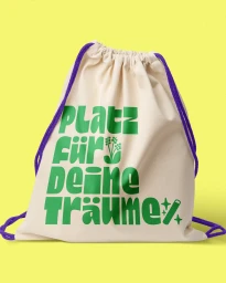
EIGA developed the brand identity for Katholino, a project defined by a bold, saturated color palette and playful, illustrative graphic design. The system leans into a high-energy aesthetic, pairing vibrant pinks, greens, and purples with heavy, modern typography to establish a cohesive visual language across both print and digital assets. The identity features a diverse range of printed collateral, including brochures, notebooks, and promotional stationery. Each element integrates whimsical illustrated motifs—such as animals and floral emblems—with clean, geometric layouts. This versatility is extended through motion graphics and animation, where the floral logo marks morph and shift in color, underscoring the brand's dynamic nature.
Vertical
Solid Colour
