
Gogo: Brand Identity


Nov 2022
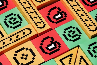
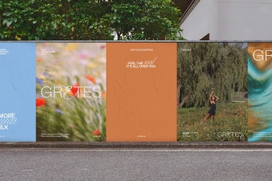
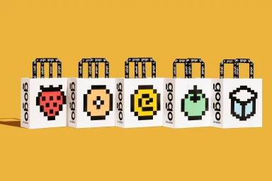
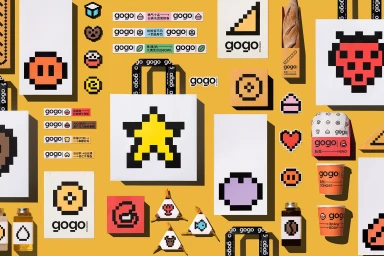
The brand identity for Gogo establishes a comprehensive visual system that bridges commercial packaging and editorial lifestyle photography. Central to the project is a modular design language that utilizes retro pixel art icons, geometric color blocking, and clean typography to maintain consistency across physical and digital touchpoints. The project incorporates a wide range of assets, from structured product packaging—such as shopping bags and stationary—to outdoor advertising and lifestyle portraiture. Execution leans into minimalist principles, leveraging natural light and sharp graphic contrast to highlight textures like matte paper and metallic gold. The identity, developed by Meat Studio, Studio Daniel Siim, Les Zinc, and Atipus, balances playful digital motifs with a clean, editorial sensibility.
Horizontal, Commercial, Clean
Advertising Campaign


