
Fuku: Brand Identity



Dec 2024
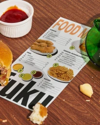
The brand identity for Fuku, developed by Red Antler, establishes a visual language centered on bold typography and a high-contrast graphic palette. The project spans across print, digital, and environmental touchpoints, using vibrant solid backgrounds—ranging from warm peach and yellow to stark black—to frame product photography and minimalist iconography. Key elements include a system of playful, food-themed stickers and custom illustrative badges that lend an energetic character to the fast food branding. The motion design assets and instructional graphic design emphasize clean composition, utilizing motion graphics and live-action techniques to showcase menu staples like the fried chicken sandwich, tenders, and signature sauces. Application extends to custom apparel and physical collateral, including menus and directional signage. The overall aesthetic leans into a minimalist, graphic-heavy style that maintains consistency through a distinct typographic hierarchy and tactile visual motifs.
Horizontal, Commercial, Clean, Graphic
Advertising Campaign
