
FranklinTill: Brand Identity






Sep 2018
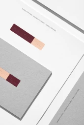
The brand identity for FranklinTill stands as a masterclass in tactile minimalism, effectively bridging the gap between high-end commercial aesthetic and professional corporate design. Executed with precision by COMMISSION, the project leans into a sophisticated visual language that prioritizes material quality and geometric rigor. Across the suite of assets, the identity utilizes emboss and deboss techniques to transform simple, heavy-weight paper stocks into immersive brand experiences, where the logotype becomes a sculptural element rather than a flat graphic. This emphasis on tangibility is balanced by a deliberate color-blocking strategy, juxtaposing vibrant neon yellow, coral, and royal blue against muted, organic earth tones and crisp off-white surfaces. The project channels an abstract sensibility, particularly through its use of soft light and careful composition, which elevates everyday stationery and digital interface elements into pieces of cohesive art. By integrating typography that speaks to material and color futures, the brand identity establishes a clear, modern voice within the technology and digital platform sector. Whether through the organized randomness of scatter-laid enamel pins or the structured grid of debossed stationery, the work reflects a deep understanding of negative space and industrial materiality. It is a refined, polished effort that maintains a consistent, high-key atmosphere, proving that corporate branding can be both functional and deeply artistic in its execution.
Artistic, Vertical, Minimalist, Clean
Typography
White Seamless
Website / Web
