
Several
Brand Identity
Jan 2016
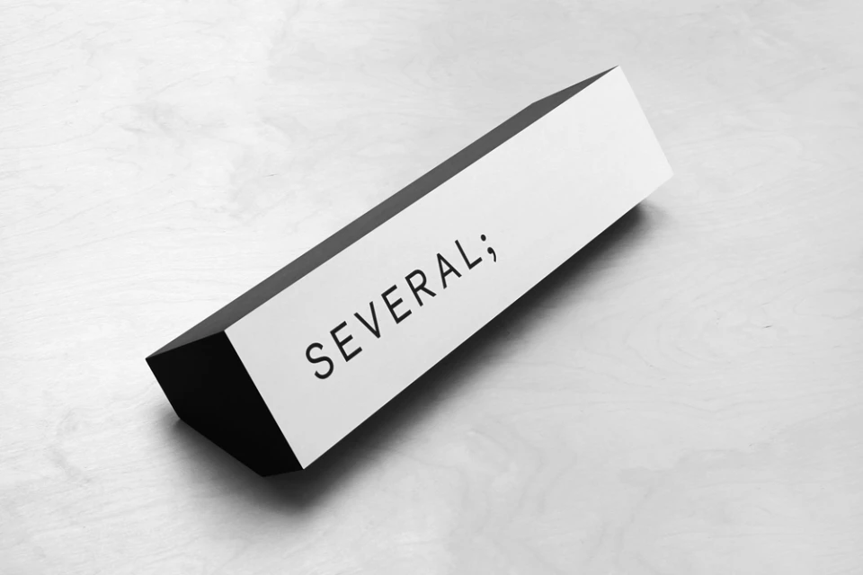
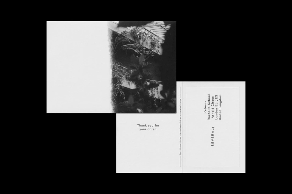
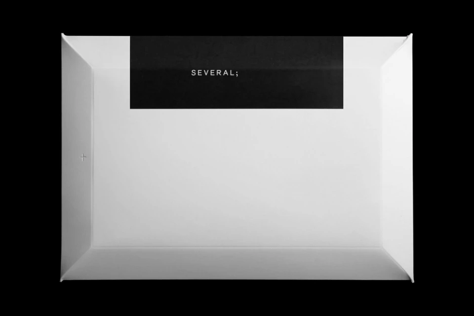
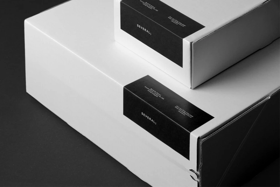
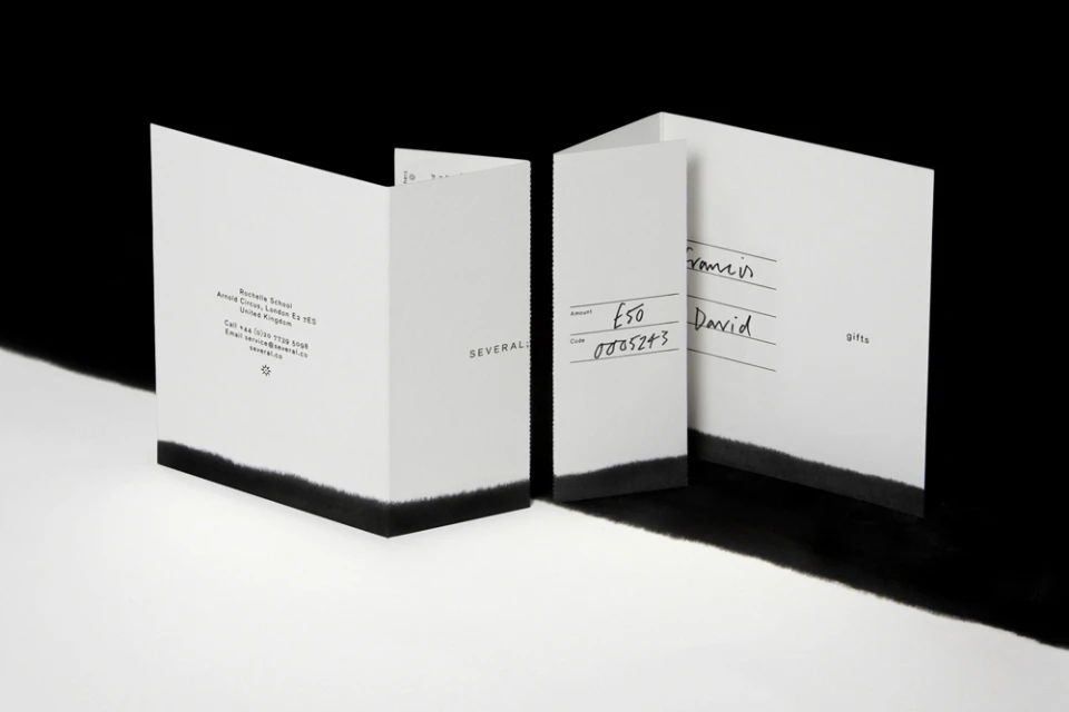
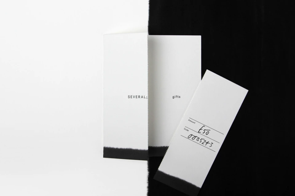
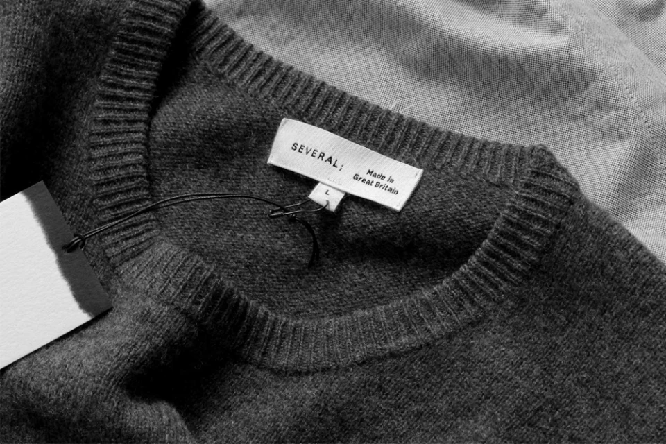
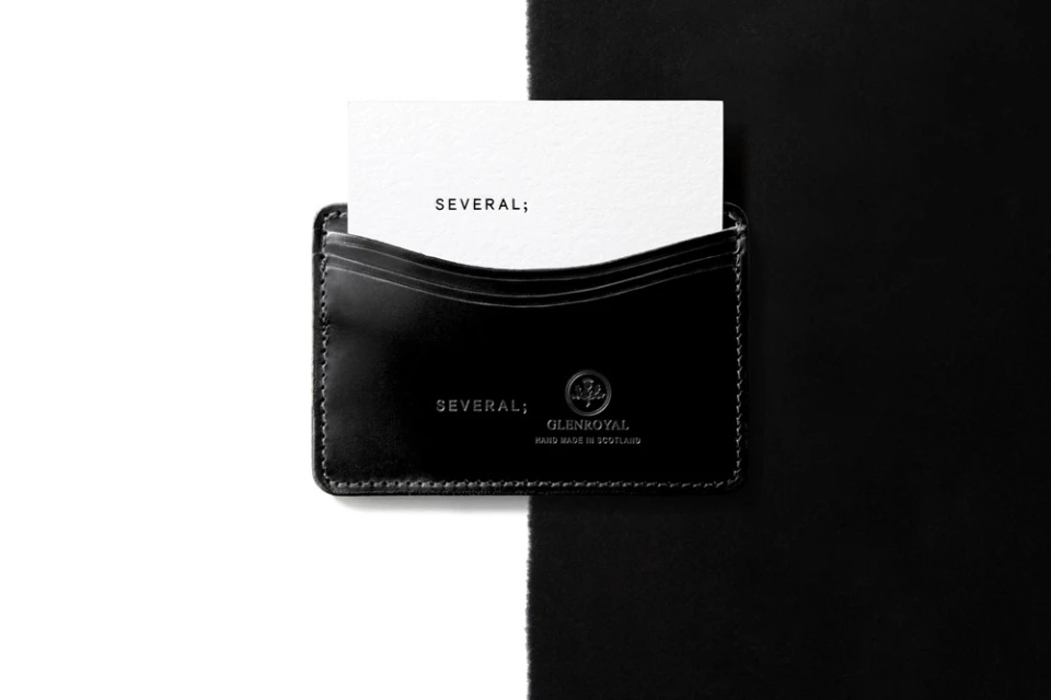
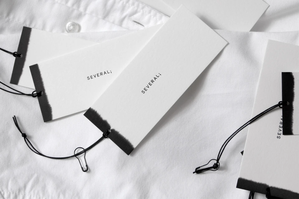
The brand identity for Several is a masterclass in editorial minimalism, leaning heavily into a refined monochromatic palette to establish a sophisticated market presence. By stripping away visual noise, the project centers on the evocative power of negative space and precise sans-serif typography, creating a cohesive visual language that feels both modern and deeply tactile. The design execution, spearheaded by the team at COMMISSION, masterfully plays with contrast through high-contrast black-and-white compositions that elevate standard retail touchpoints into deliberate design objects. From the geometric clarity of studio-lit shipping boxes to the subtle, artisanal ink-wash textures on stationery, every asset serves to reinforce a premium, intentional aesthetic. The work balances commercial utility with an editorial sensibility, utilizing techniques such as analogue film and studio strobe lighting to emphasize the material quality of the paper stocks, knit textiles, and leather goods. Whether showcasing a simple gift voucher or the intricate stitching on a fabric label, the project relies on a restrained design approach where the identity—anchored by the signature semicolon—is never overwhelmed by its own components. This project succeeds by proving that brand identity functions best when it communicates with clarity and consistency, transforming everyday functional elements into a unified brand experience that feels as much like an art exhibition as it does a commercial rollout.
Horizontal, Commercial, Clean, Minimalist
Typography
