
fraenk: Brand Identity


Jul 2026
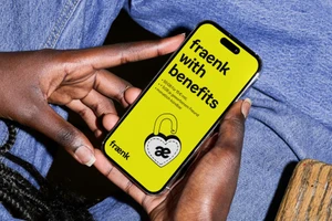
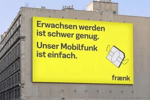
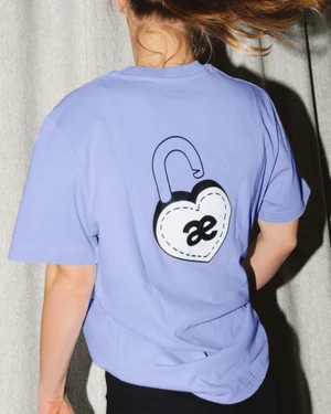
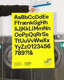
The brand identity for telecommunications provider fraenk serves as a masterclass in how to build a disruptive market presence through uncompromising aesthetic consistency. By leaning into a high-contrast visual language defined by a signature vibrant yellow and bold, sans-serif typography, the project succeeds in transforming functional utility into a lifestyle movement. The design, spearheaded by Make Studio, prioritizes a minimalist, graphic approach that feels both accessible and distinctly modern. Central to this identity is the custom typeface derived from the Greed font by Displaay Type Foundry, which provides a cohesive typographic backbone across everything from massive urban billboards to digital interfaces and apparel. Playful elements, such as the winged SIM card illustrations and Ronja Overländer’s expressive, flat-style vector art, ground the brand in a human-centric narrative that sidesteps the usual sterile tropes of the mobile industry. Throughout the series of commercial assets, the application of bright, even lighting and natural light ensures that the yellow-on-black color palette remains the dominant focal point. Whether it is displayed on a physical poster or worn as a graphic t-shirt, the identity functions with remarkable clarity. By successfully blending lifestyle photography with strict, clean branding, the project establishes a recognizable, high-energy environment that reinforces the core promise of simplicity and digital ease, proving that a brand can be both structurally disciplined and creatively vibrant.
Commercial, Graphic, Vertical

