
Format: Brand Identity
Jan 2019
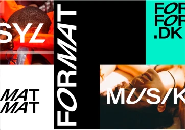
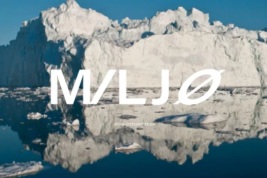
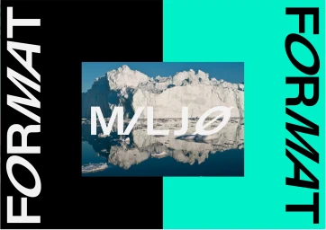
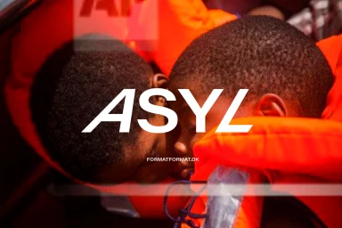
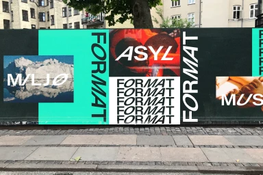
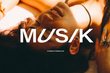
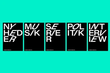
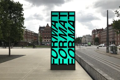
The brand identity for Format functions as a masterclass in modern, high-contrast visual communication, bridging the gap between digital platforms and physical urban environments. Crafted by the team at Poulsen Projects, the design system leans into editorial minimalism to create a versatile graphic language that feels both authoritative and approachable. Central to the work is a bold, sans-serif typography that serves as the visual anchor, often presented in slightly italicized forms to suggest forward motion and professional urgency. By utilizing a punchy palette of vibrant orange, deep black, and bright teal, the brand achieves high-contrast aesthetic impact across diverse mediums, from outdoor hoarding installations and digital billboards to intimate, cinematic lifestyle photography. The project effectively integrates typography with natural landscape imagery, such as the striking icebergs reflected in calm water, to balance the rigid geometric precision of its UI illustration elements. Throughout the campaign, the design team employs soft light and warm, golden-hued tones to inject a human element into the structured layout, resulting in a cohesive brand identity that thrives on rhythmic, grid-based compositions. This synthesis of motion graphics and static, typography-heavy design provides Format with a distinct presence that remains legible and engaging, whether viewed on a handheld device or experienced as a large-scale structural piece within a bustling public plaza.
Horizontal, Commercial
Typography
Advertising Campaign
