
FEW Magazine: Brand Identity





May 2021
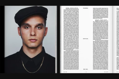
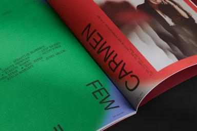
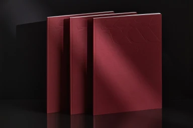
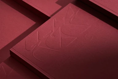
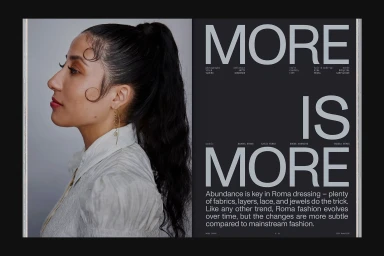
This brand identity project for FEW Magazine centres on a minimalist editorial design system defined by rigorous typographic hierarchies and tactile materiality. Developed by graphic designers Marina Veziko and Tino Nyman, the visual language moves between stark, clean layouts and high-contrast color blocking, anchoring dense historical text columns with expansive white space and oversized sans-serif headers. The project incorporates sophisticated production techniques, including emboss and deboss detailing on matte, heavy-stock covers that emphasise physical texture. Captured by photographer Aleksi Tikkala, the supporting imagery leans into a clean, editorial aesthetic, utilizing natural light to cast subtle shadows that heighten the depth of the publication's graphic layers. By balancing traditional serif body copy with bold, modern typography, the identity establishes a contemporary publishing standard rooted in print craftsmanship.
Editorial, Horizontal, Clean
Editorial


