
FEW: Brand Identity
Mar 2025
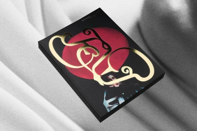
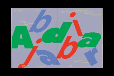
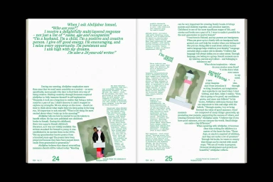
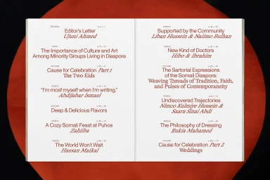
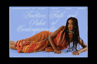
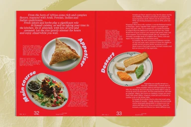
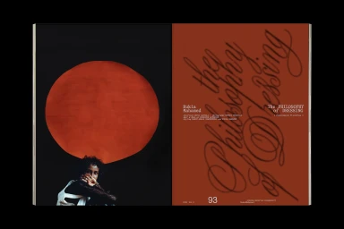
The brand identity for FEW encompasses a comprehensive publication design project within the media and entertainment sector. The work leverages a refined editorial aesthetic, defined by dynamic typography, bold color fields, and a minimalist approach to layout across both print and digital platforms. Central to the visual language is a series of saturated spreads that feature expressive graphic design, including vector-based overlays and intricate emboss and deboss techniques on tactile book covers. Motion graphics are integrated to introduce depth, using 3D renders that highlight the publication's material quality and logo identity. Led by project owner Visie Admin, the creative execution involved graphic design by Marina Veziko, Tino Nyman, Tytti Halonen, and Matilda Diletta, with logo development by Jaakko Suomalainen and motion work by Lauri Tiainen. Editorial direction was provided by Editor-in-Chief Ujuni Ahmed, while cover photography was captured by Severi Uusitalo and Karoliina Bärlund.
Horizontal, Clean, Editorial
Typography
Editorial


