
FAZER
Brand Identity
Apr 2018
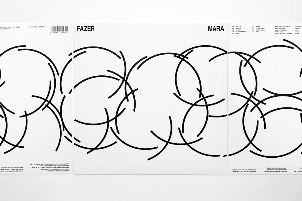
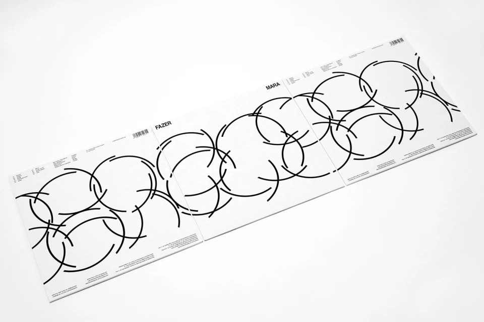
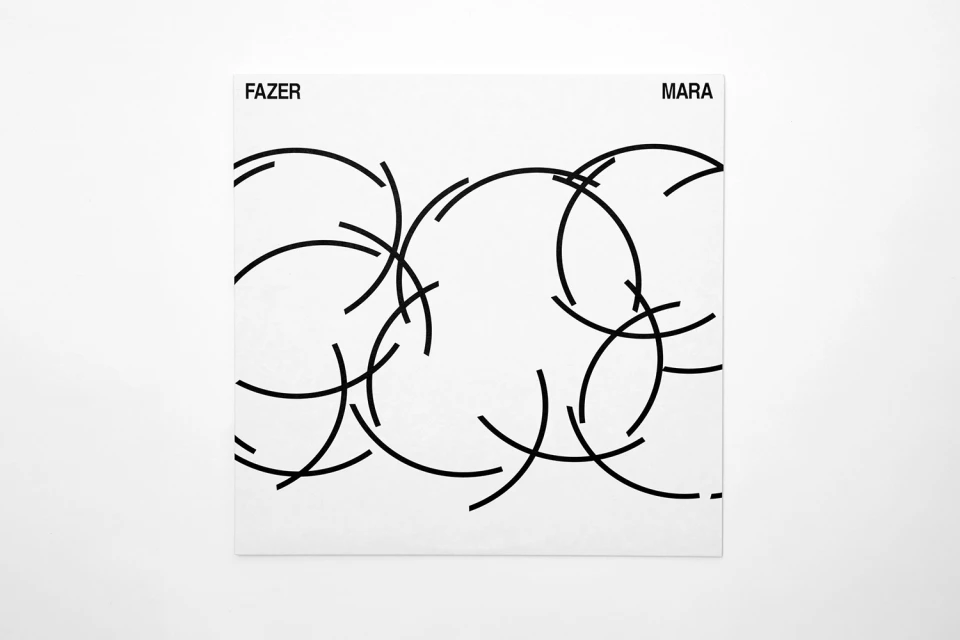
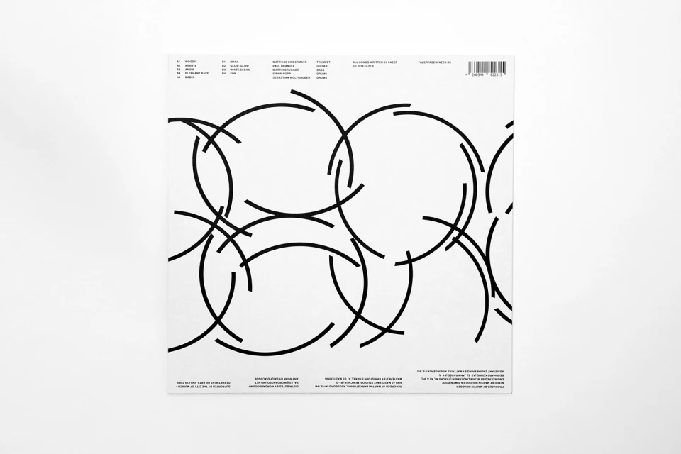
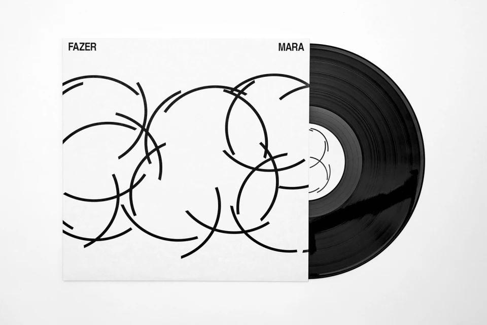
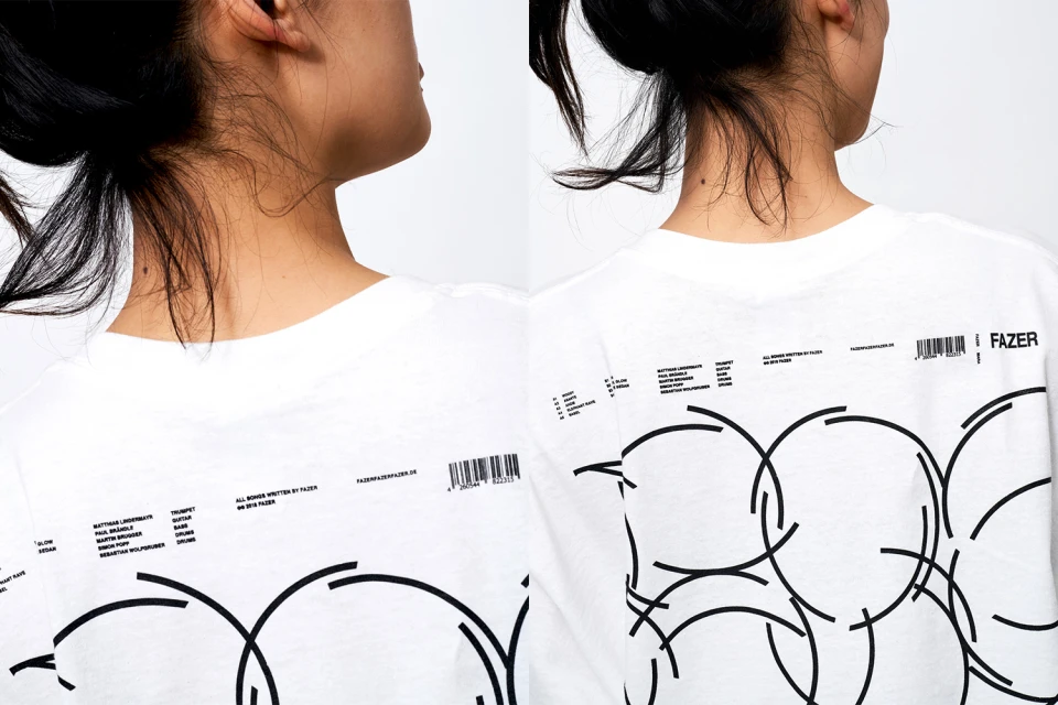
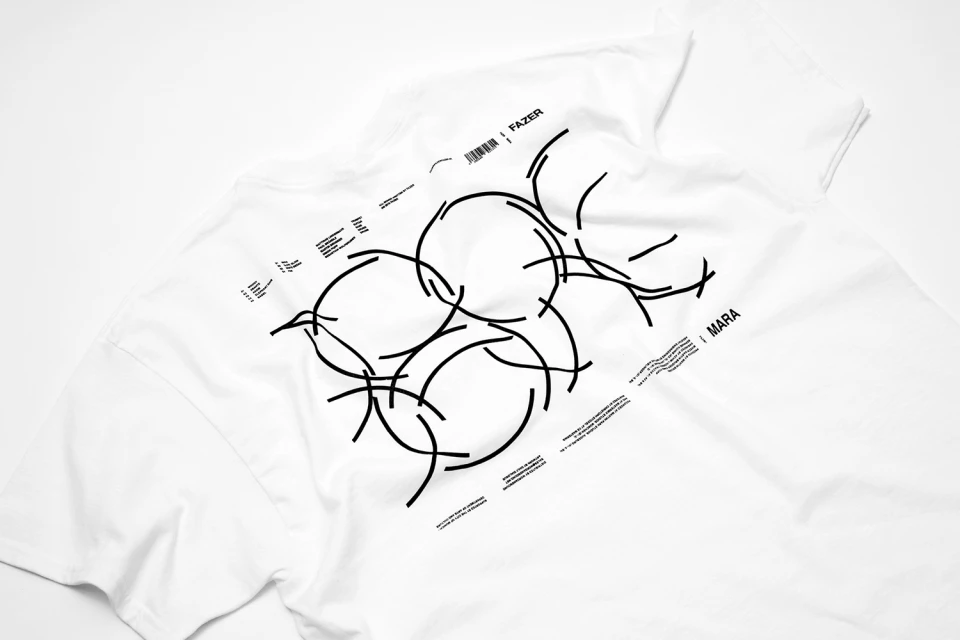
The visual identity for the music project FAZER, titled Mara, represents a masterclass in minimalist graphic design and cohesive brand building. Executed by the studio Daily Dialogue, the project establishes a stark, high-contrast visual language that leans into modern geometric abstraction. By utilizing a monochrome palette of crisp white and deep black, the identity centers on a series of thin, interlocking circular arcs that create a sense of dynamic movement across various media applications. The aesthetic is intentionally clinical and clean, drawing heavily on professional typography and precise vector layouts to anchor the band's identity. From the album cover art to the functional back-cover tracklists and screen print merchandise, the project demonstrates a rigorous attention to negative space and balanced composition. The work bridges the gap between commercial product design and editorial minimalism, favoring a functional, clean approach that prioritizes typographic clarity. Whether applied to vinyl sleeves or textile surfaces like cotton t-shirts, the geometric motif remains instantly recognizable, providing a tactile, contemporary presence. By eschewing unnecessary ornamentation in favor of a restrained, modern aesthetic, FAZER effectively transforms its branding into a sophisticated visual system that feels both timeless and distinctly rooted in the contemporary music landscape.
Horizontal, Clean, Minimalist, Commercial
Typography
Music
White Seamless
Advertising Campaign
