
Fatlash
Brand Identity
Oct 2016
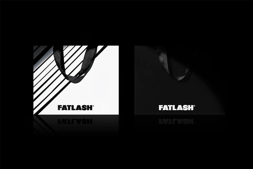
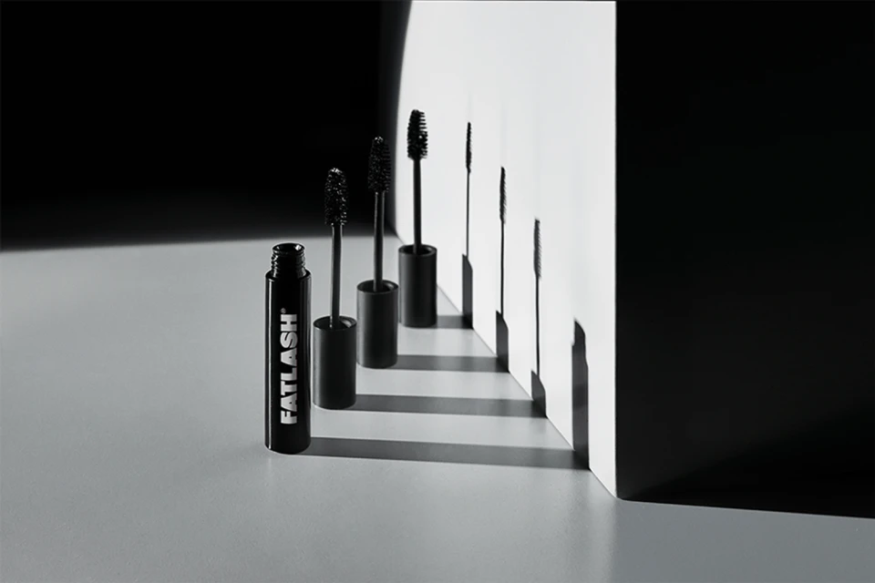
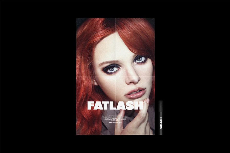
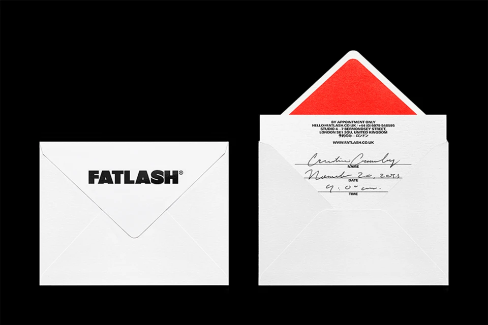
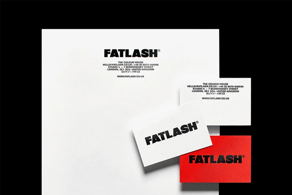
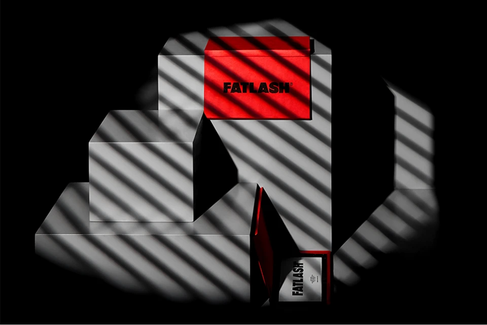
The brand identity for Fatlash functions as a masterclass in editorial minimalism and monochromatic precision. Executed by the design house Anagrama, the visual system leans heavily into high-contrast aesthetics to elevate the brand from a standard beauty label to a sophisticated design-led entity. By utilizing a strictly black, white, and occasionally red palette, the project establishes a commanding graphic presence that bridges the gap between commercial reliability and high-fashion luxury. The identity relies on bold, sans-serif typography as its core pillar, which is applied across everything from tactile stationery and structured shopping bags to product packaging. Through the lens of studio strobe lighting, the work leverages low-key chiaroscuro techniques to heighten the architectural quality of the materials, turning simple ephemera like envelopes and business cards into geometric, sculptural objects. The photography further bridges these worlds, juxtaposing sharp, product-focused still lifes with emotive, crease-lined portraits that ground the conceptual branding in a human context. By maintaining a cohesive focus on structural forms and rhythmic light-and-shadow play, Anagrama has crafted a visual language that feels both timeless and aggressively modern. This project demonstrates how meticulous attention to detail in paper stock, alignment, and graphic weight can create a powerful, immersive brand ecosystem that commands attention in a saturated market, proving that when typography is treated with such deliberate intent, it becomes the brand's most compelling asset.
Horizontal, Commercial, Minimalist, Clean
Typography
Black Seamless
Advertising Campaign
