
Bokeria
Brand Identity
Sep 2016
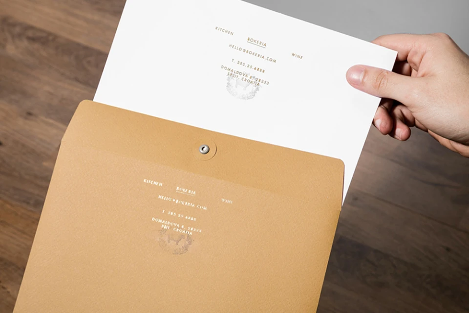
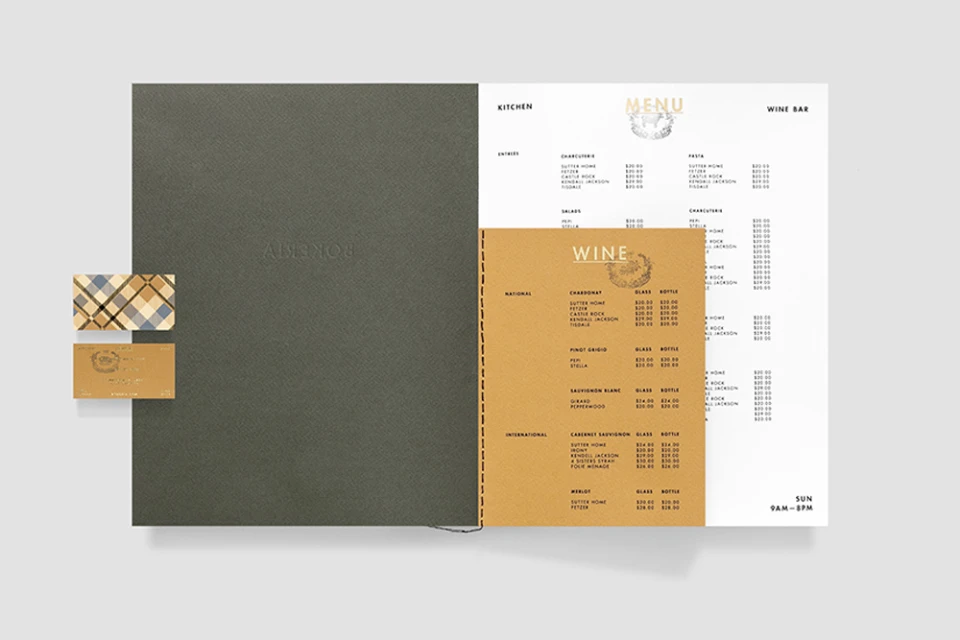
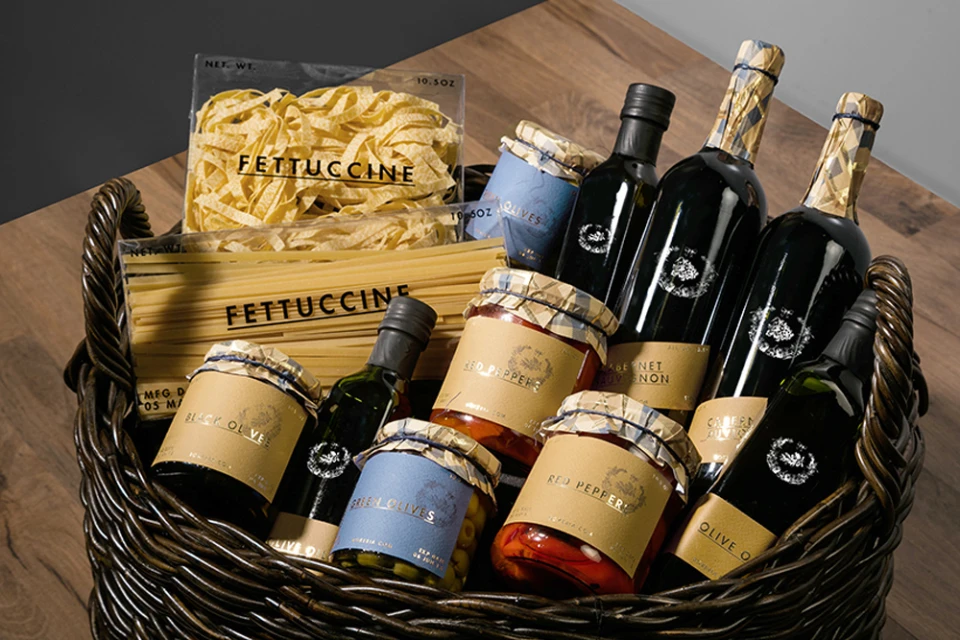
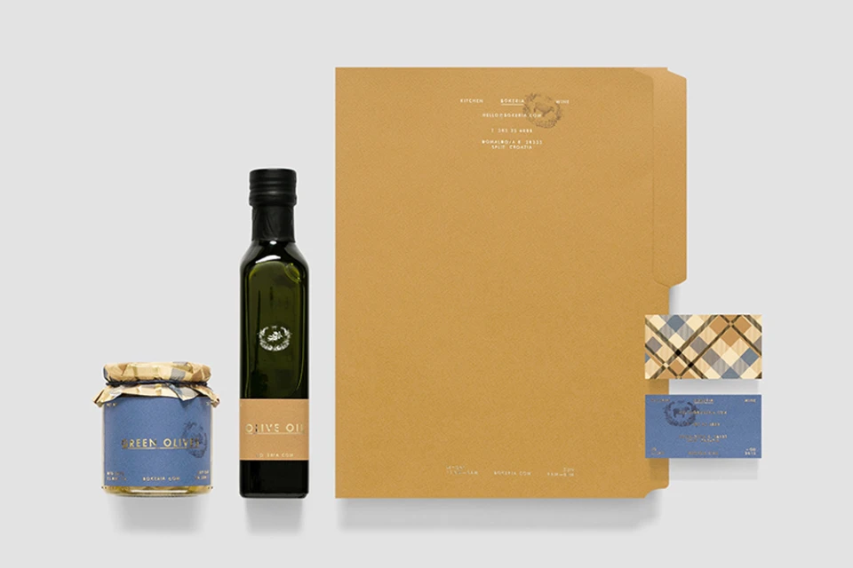
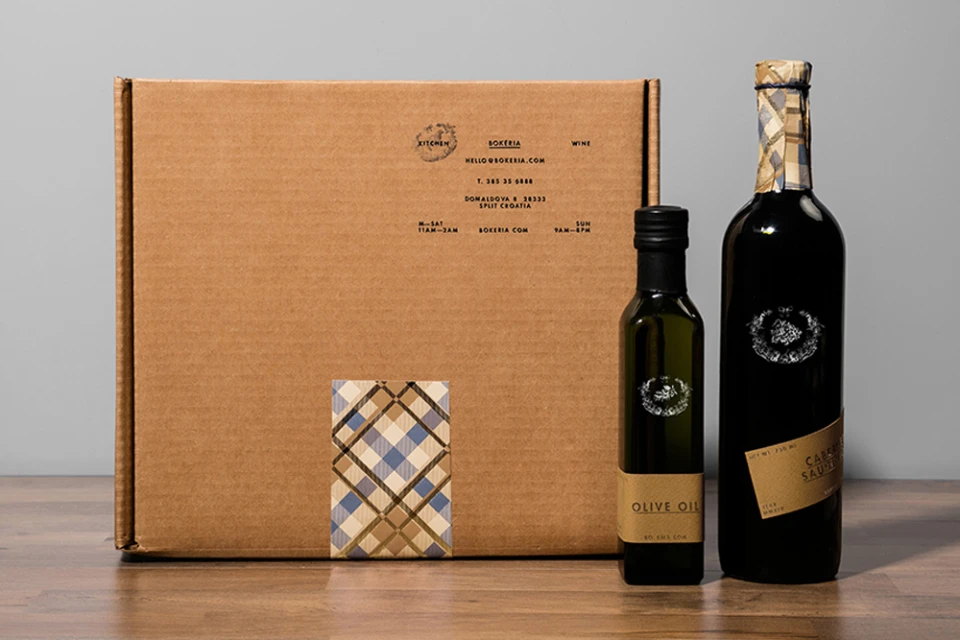
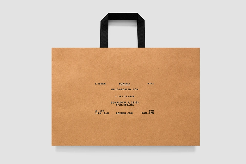
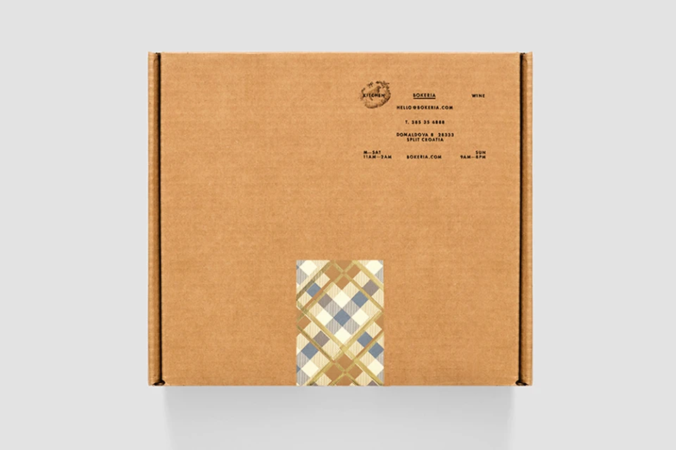
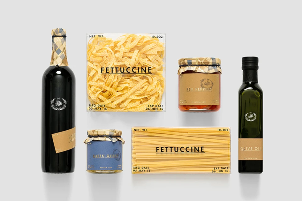
The brand identity for Bokeria, a restaurant rooted in Split, Croatia, establishes a sophisticated visual language that masterfully balances raw, tactile textures with high-end corporate refinement. Designed by Anagrama, the identity leans into a restrained, minimalist aesthetic that feels both contemporary and deeply connected to the culinary craft. By utilizing a muted, earthy color palette of tan, slate blue, and charcoal grey, the studio creates a cohesive system that extends from essential stationery and menus to artisanal food packaging. The design relies heavily on clean typography, employing a sans-serif wordmark that functions as a structural anchor across various collaterals, including kraft paper bags and corrugated shipping boxes. The project excels in its tactile execution, utilizing thick, heavy-weight paper stocks and debossed details to elevate standard brand elements. Notable is the introduction of a subtle plaid pattern in cream and blue, which adds a decorative, geometric layer to the otherwise austere, editorial minimalism of the packaging. Through the lens of commercial studio photography, the identity emphasizes structural balance, using professional studio strobe techniques to highlight the juxtaposition between industrial materials and the premium quality of the gourmet food products. This comprehensive branding strategy serves as a masterclass in modern, functional corporate identity, turning essential restaurant collateral into a cohesive and memorable sensory experience.
Horizontal, Clean, Commercial
Advertising Campaign
