
Faberlic: Brand Identity
Jun 2021
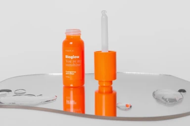
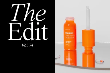
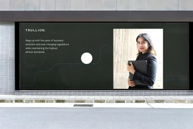
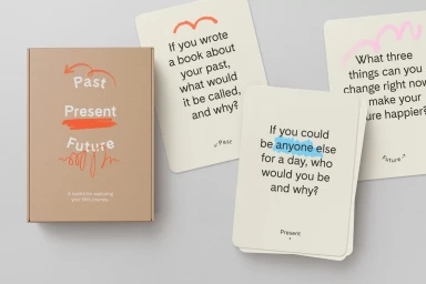
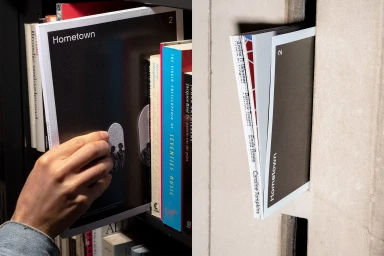
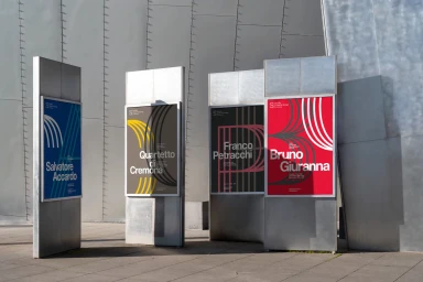
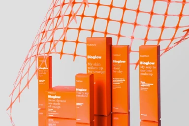
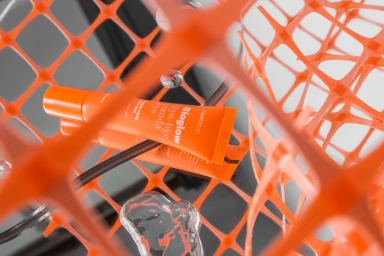
Faberlic presents a comprehensive brand identity project, bridging product-centric design with environmental graphic applications. The visual system integrates vibrant, monochromatic palettes with minimalist typography and geometric structural elements, seen across both skincare packaging and outdoor urban installations. Executed with a clean, graphic sensibility, the project includes tactile print materials, custom editorial layouts, and large-scale public displays. The work maintains a consistent aesthetic through the use of soft studio lighting and intentional spatial arrangements, highlighting the interplay between the brand's primary orange motifs and neutral, architectural backgrounds.
Horizontal, Commercial, Clean
E-commerce / Product


