
Entre Pierre & Terre: Brand Identity




Feb 2020
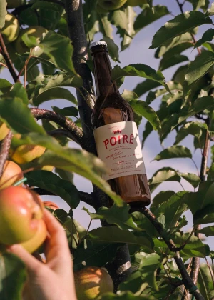
The brand identity for Entre Pierre & Terre acts as a masterclass in minimalist packaging design, seamlessly bridging the gap between raw, organic origins and modern, high-end shelf presence. Developed by Wedge, the project breathes life into the craft alcoholic beverages sector through a sophisticated visual language that prioritizes tactile textures and clean, high-contrast layouts. The execution leans heavily into a deliberate two-tone palette, where bold red hand-drawn typography pops against cream-colored paper labels, grounding the products in an artisanal aesthetic. By integrating professional commercial product photography—characterized by soft, even lighting—with intimate, lifestyle-oriented shots taken within lush orchards, the brand successfully narrates its own history from the fruit tree to the bottle. The clever inclusion of a smiling dog motif on the crown caps adds a touch of playful personality, preventing the minimalist design from feeling overly clinical. This project manages to balance the technical precision of graphic design with a cinematic, natural light approach to lifestyle imagery, effectively positioning Entre Pierre & Terre as a premium choice for consumers. Ultimately, the work succeeds by emphasizing the intersection of heritage and craft, using refined vector typography and considered composition to elevate standard cider and perry packaging into a cohesive, memorable identity that resonates with both local tradition and contemporary design sensibilities.
Commercial, Clean, Vertical
E-commerce / Product
