
Drav: Brand Identity

Mar 2019
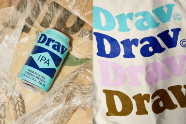
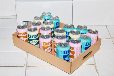
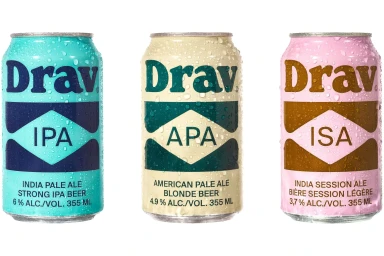
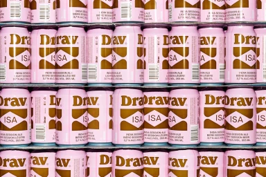
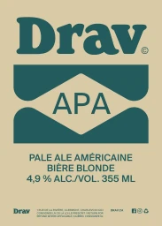
The brand identity for Drav Biere serves as a masterclass in modern minimalist design within the competitive alcoholic beverages sector. By leaning into a high-key commercial aesthetic, the project establishes a distinct visual rhythm that feels both sophisticated and accessible. The creative execution, managed by Wedge, centers on a disciplined use of typography and geometric structure to anchor the brand across various touchpoints, from clean studio product photography to layered textile applications. The visual identity successfully balances industrial consistency with a vibrant color palette, utilizing soft pastels, metallics, and bold serif fonts that shift fluidly across different ale variants. Whether displayed against a stark white backdrop or contrasted against raw textures like unfinished pine wood, the branding maintains a sharp, deliberate presence. Through the clever integration of high-speed freeze techniques to capture condensation on chilled cans and clean UI illustration that emphasizes technical specs, the work avoids the clutter typical of the category. Instead, it leans into editorial minimalism, favoring bold, stylized serif choices and symmetrical forms that transform standard packaging into a cohesive design system. The result is an intentional, graphic-forward identity that translates effortlessly from shelf-ready industrial packaging to high-end promotional merchandise, proving that a refined approach to minimalism is the most effective way to communicate craft quality in a saturated food and beverage market.
Commercial, Clean
E-commerce / Product
