Diana's Seafood: Brand Identity


Mar 2025
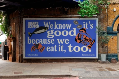
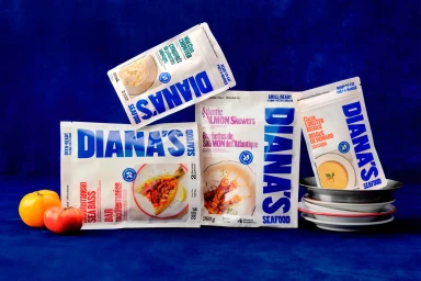
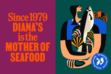
Diana's Seafood introduces a comprehensive brand identity that centers on bold typography and vibrant, stylized illustration. The project establishes a distinct visual language across physical packaging, outdoor advertising, and motion assets, leaning into clean, minimalist graphic design to define the brand's market presence. The visual system utilizes a tactile color palette of rich blues, greens, and reds, complemented by vector-based illustrations of marine life and culinary elements. By integrating commercial photography with clean motion graphics and vector animation, the identity maintains a consistent, modern aesthetic across all touchpoints. Wedge led the graphic design, with illustration contributed by Bill Rebholz. The project's photographic and motion capture was handled by Michael Kazimierczuk and Garrett Naccarato.
Horizontal, Commercial, Clean