
Brand
ProjectBrand Identity
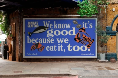
Diana's Seafood Brand Identity 2025
Associated creatives



Tags
Description
An outdoor advertising billboard for Diana's Seafood is mounted on a textured brick building exterior above a stone-paved sidewalk. The large rectangular sign features a vibrant blue background with cream-colored typography reading We know good because we eat it, too alongside graphic illustrations of a fish, a lobster, and a crab. The branding project includes graphic design by Wedge and illustration by Bill Rebholz, with photography captured by Michael Kazimierczuk and Garrett Naccarato. Natural light illuminates the urban street setting, highlighting the weathered brickwork and pavement textures.