
Brand
ProjectBrand Identity
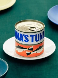
Diana's Seafood Brand Identity 2025
Associated creatives



Tags
Description
A close-up photograph of branded seafood packaging created for Diana's Seafood as part of a brand identity project. Two cylindrical tuna cans are stacked upright on a small white saucer, resting on a dark green textured surface. The top can features bold blue typography against a white label band, while the bottom can displays a vibrant orange section illustrated with stylized black and white fish graphics. Additional blurred ceramic plates in yellow and blue sit partially in the corners of the composition, adding depth. The lighting is soft and even, highlighting the clean graphic lines of the product design.