
Datura: Brand Identity

Brand
Date
Jun 2025
Description
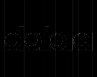
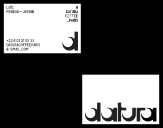
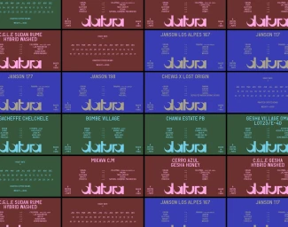
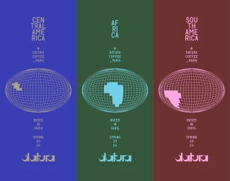
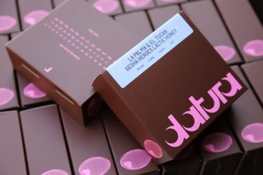
Datura’s brand identity project, designed by Brand Brothers, establishes a cohesive visual language for the coffee producer. The system centres on precise vector geometry and a minimalist typographic hierarchy, utilizing bold lowercase logotypes alongside unique, crescent-shaped counterforms to anchor the brand signature. The project integrates a multi-panel layout across product packaging, including metallic canisters and matte-finish boxes. The graphic elements feature a diverse color palette and structured wireframe globe illustrations to distinguish coffee origins and processing methods, balancing corporate clarity with modern commercial design.
Style
Horizontal, Commercial
Techniques
Typography, Vector
Industries
Context
Advertising Campaign
Associated creatives

5000+ creatives to discover
Sign up to gain access to the entire directory. It’s free.
Visie is a curated library of creative professionals.