
Metode: Brand Identity


Nov 2019
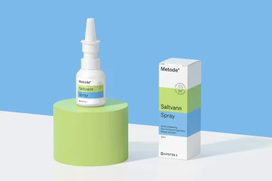
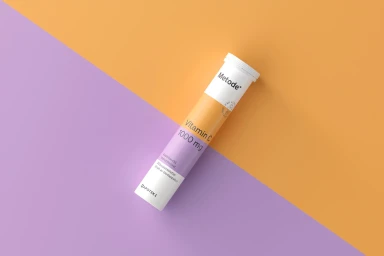
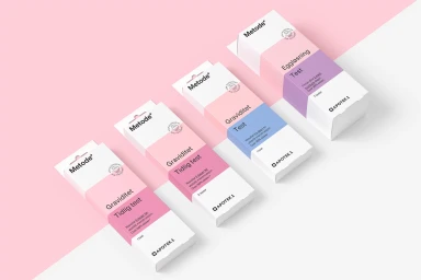
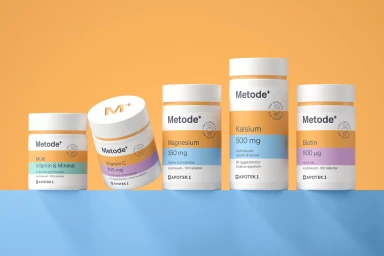
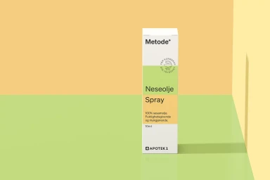
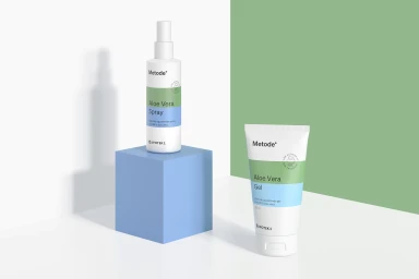
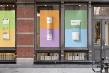
The brand identity for Metode represents a sophisticated evolution in pharmaceutical retail, bridging the gap between clinical reliability and contemporary lifestyle appeal. Developed with graphic design expertise from Goods, the project establishes a cohesive visual language that prioritizes clarity and organization across a vast product ecosystem. By utilizing a deliberate minimalist aesthetic, the brand identity centers on clean sans-serif typography and a strategic approach to color-blocking, where pastel hues such as sage green, lavender, and soft orange serve as functional markers for different supplement and skincare categories. Each commercial packshot employs soft light and bright, even illumination to emphasize the geometric precision of the packaging, ensuring the products stand out in both digital retail and physical storefront environments. The visual system effectively leans into editorial minimalism, eschewing clutter in favor of a balanced, modern composition that treats health products as premium lifestyle objects. This consistent design framework creates a seamless transition from individual product packaging to large-scale environmental graphics, as seen in the vibrant, high-contrast posters displayed across retail facades. Ultimately, the work succeeds by transforming standard diagnostic and wellness tools into a recognizable, approachable, and highly organized brand system that maintains professional authority while inviting consumer engagement through its fresh, graphic, and visually rhythmic presentation.
Horizontal, Commercial, Clean, Minimalist
3D render / CGI
E-commerce / Product
