
Carmel Cannabis: Brand Identity






Apr 2021
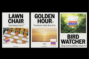
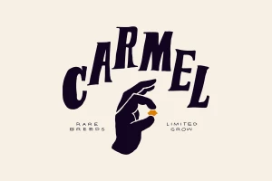
Carmel Cannabis establishes a cohesive visual language through this comprehensive brand identity project, spearheaded by the design studio Wedge. The work centers on a clean, minimalist aesthetic that integrates bold typography with high-contrast graphic applications across both physical merchandise and digital platforms. Spanning product packaging, apparel, and UI design, the identity leans into a versatile palette of blue, orange, and red. The visual system effectively balances utilitarian product information with stylized graphic elements, as seen in the layered typography on product pouches and the intentional use of negative space across marketing collateral. By combining studio-based product shots with naturalistic compositions, the branding communicates an artisanal, premium positioning for the cannabis sector.
Horizontal, Commercial, Clean, Minimalist
Typography
White Seamless
