
Cabinet: Brand Identity



Nov 2019
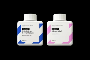
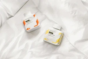
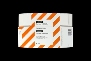
Cabinet is fundamentally rewriting the visual language of the CPG food and beverage and pharmaceutical landscape through a masterfully executed brand identity. By stripping away the chaotic noise often associated with medicinal packaging, the project leans into a rigorous, minimalist ethos that prioritizes clarity and modern aesthetic precision. Executed with high-level graphic design by Otherway, the system relies on a consistent, typography-driven architecture that transforms functional medicine into a high-end lifestyle object. The visual narrative utilizes high-key lighting and natural light in studio product photography to emphasize the clinical cleanliness of the signature square-shaped white bottles, while bold, geometric corner accents provide a systematic color-coded hierarchy. This approach is further extended through 3D render and CGI techniques that highlight the stark, high-contrast typography, ensuring that the brand remains legible and recognizable across digital touchpoints. The digital interface, showcased through precise UI illustration, reinforces this commitment to simplicity, offering an organized and frictionless user experience that mirrors the physical packaging. By balancing functional, clinical elements with a clean, contemporary design sensibility, the brand identity achieves a sense of order that is both refreshing and highly professional. This identity does not just house medication; it signals a new, design-forward standard for how consumers interact with essential daily goods in an increasingly saturated market environment.
Horizontal, Commercial, Clean, Minimalist
