
Brompton Bicycles: Brand Identity


Jul 2024
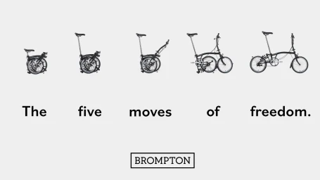
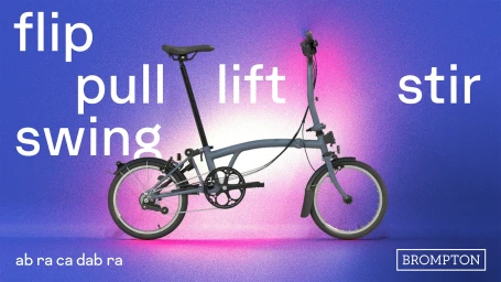
Brompton Bicycles revitalizes its visual identity through a series of motion graphics and commercial assets that emphasize the folding mechanism of its iconic urban transport. Studio Blackburn and Time Based Arts lead the design and production, implementing a clean, minimalist aesthetic that leans into vibrant, saturated color palettes and structured typography. Across both static and motion deliverables, the project utilizes graphic design and 3D animation to break down the product's engineering into a rhythmic visual language. By pairing kinetic typography with fluid product demonstrations, the work highlights the utility and portability of the bicycle. Havas Media UK supported the project, which frames the folding process through varied, high-contrast compositions and consistent branding.
Clean, Commercial, Horizontal
Brand Film / Corporate Video


