
Bolt: Brand Identity

Mar 2023
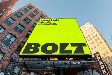
Bolt's brand identity refresh establishes a high-contrast visual language built for the digital platform space. Developed by Koto, the project utilizes a bold, vibrant color palette—anchored by lime green and yellow—to define the brand’s presence across both physical and digital touchpoints. The execution relies on kinetic typography and clean motion graphics, prioritizing readability and speed. From the modular grid systems seen in motion sequences to the sharp, vector-based graphic elements, the design system emphasizes modern digital usability and technical clarity. Outdoor advertisements and app interface demonstrations illustrate the brand's versatility. The project integrates custom typography and stylized glyphs to maintain consistency, framing the Bolt identity through a high-energy, commercial aesthetic.
Horizontal, Commercial
Motion Graphics
Solid Colour
Brand Film / Corporate Video
